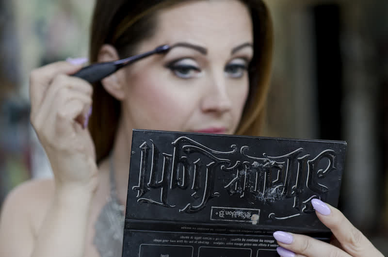
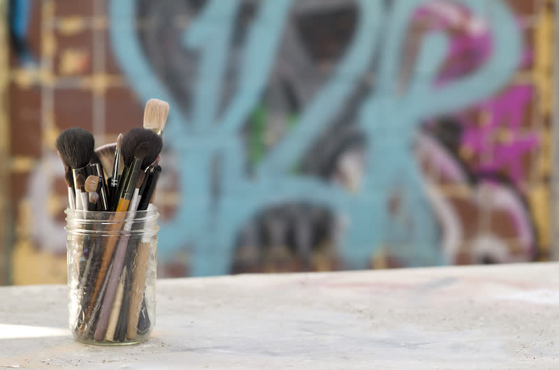
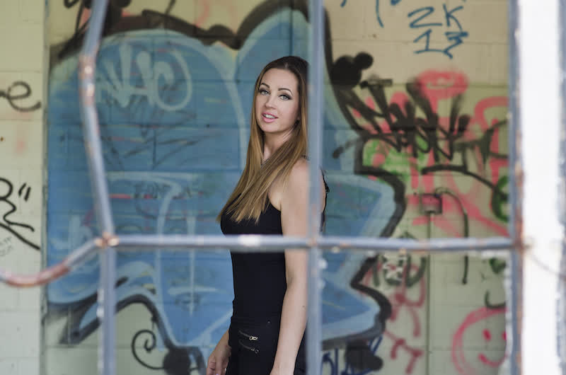
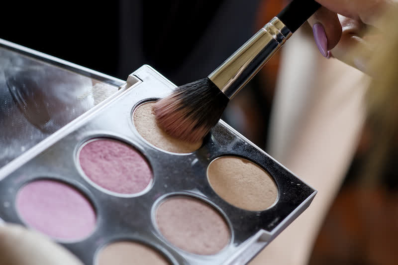
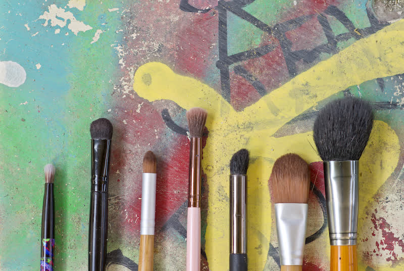
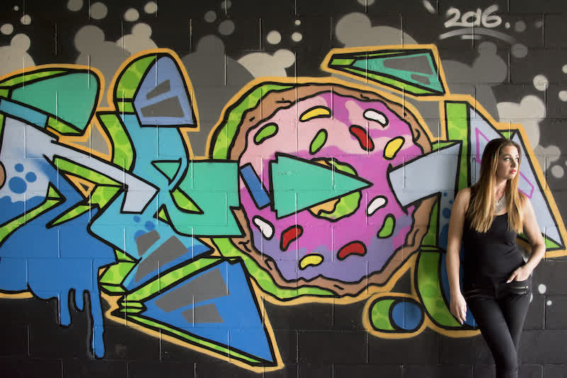
Now THIS is what a photoshoot looks like when its managed by your marketing team! These were planned to provide the foundation for a website, Facebook ads and print material that clearly represents Kelly’s bold colour & grunge brand.
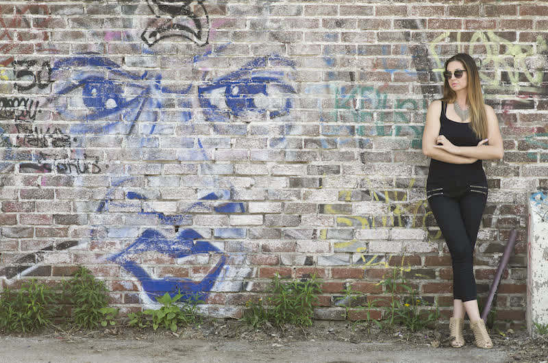
As you can see, in many cases the subject is pushed to the far side of the image, providing LOTS of space for text, content or information. Images will dominate the new website, as this is the best way to create a state of mind and feeling for your clients.
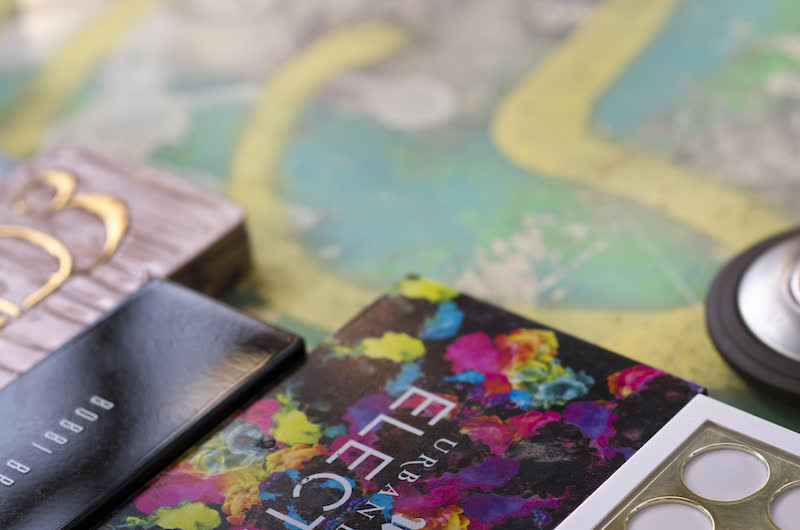
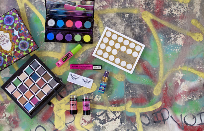
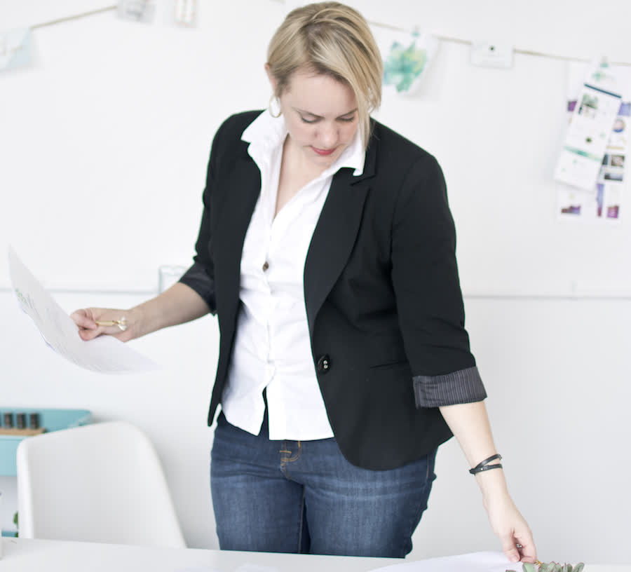
The photoshoot included not just images of Kelly herself, but also images of her working her craft, samples of her work, a layout of her tools and general “stock” images that match her brand…
This photoshoot included:
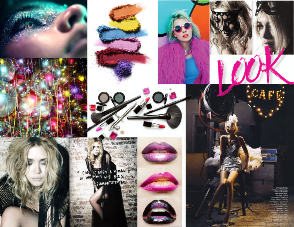
- a mood board
- scouted location
- photographer fee
- product shots
- headshots
- a stylist
- 30+ final edit images
Checkout some of the other images in the shoot below!

