OBJECTIVE: Create a logo for a new, fresh juice company. Logo has to be flexible enough to work across different flavours, and has to be light and fun. A business card was also ordered.
BRAND NOTES: This logo was a particular amount of fun for us, as pretty much everyone at the office is into fresh pressed juices. Lija, our designer, is definitely, “the ideal client” that we had to please, so she was really committed to this design.
TIPS TO TAKE HOME:
- LOGO FLEXIBILITY: Remember, if you are running a business that has a variety of products, you need to create a logo that can sit comfortably over all those products. In this case, we had to take into account that the logo would dominate the labels. It would have to be visually interesting, hint at the refreshing yumminess inside, and be flexible enough that no matter what flavour was inside, we could still use that logo.
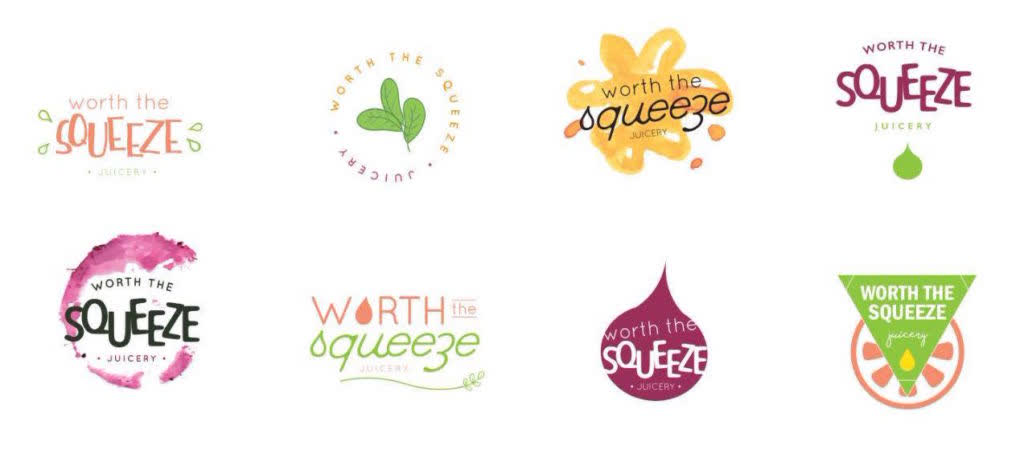
SAMPLES OFFERED TO CLIENT:
THE WINNER:
The winning logo – was our personal favourite. The BEET STAMP! for this one, we actually went to the grocery store, and purchased a beet. Lija cut it, and tried out a series of different stamps on paper before she got the shape she liked. This was then uploaded and adjusted slightly before adding the text. We also provided the client with the same logo in different colours – a lime, a tangerine, and lemon – so that it could be used on the different flavours of juices.


