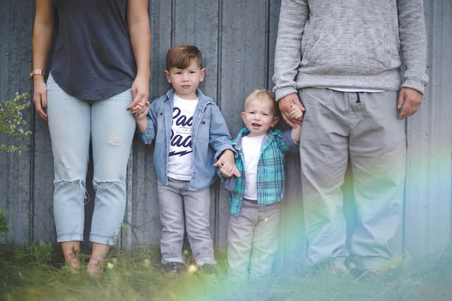
OBJECTIVE: Create a brand that fits seamlessly with family photos that Michelle had recently had done. After branding was completed, Michelle’s website was to receive an extreme facelift.
BRAND NOTES: Michelle is a family chiropractor, who specializes in working with Children. She wanted her brand to be accessible and to clearly show that family relationships were a priority. But she also wanted it to be clear that she was a chiropractor, and not a general practitioner. Michelle’s family photos were beautiful, and very consistent. So, knowing that Michelle wanted to use them throughout her brand and website, we decided to lift her new colour palette directly from the photoshoot. The soft greens, corals and blues were very inviting, and put people at ease, suggesting an environment of care.
TIPS TO TAKE HOME:
- BRAND PERSONALIZATION: This is another great example of integrating YOU into your brand. Generally we don’t recommend using something as personal as family photos to build a brand upon, but Michelle’s case was unique. Because her business was so family oriented, and she wanted to communicate that children were welcome at her practice, we knew we could work with these images. Whenever possible, you want to get a photoshoot though, to ensure that YOU are part of your brand.
- Colour Choice: You always want to make sure that you choose colours that put your client in an emotional state where they are ready to buy. If you are selling bungee jumping lessons, your colours should be bold, and exciting. But if you are a chiropractor, like Michelle, you might want to use a soothing colour palette that makes people feel safe an inviting. The soft pastels are also a colour choice that works for children as well as adults.
- Web Updates: One of the main reasons that Michelle came to us was because her website was originally built over 5 years ago. The colours for the site were rather loud, and the layout of the site also makes it look quite dated. As a professional who is involved in healthcare, you always want your marketing to look up to date, less you give clients the impression that your business is aging, tired, or not current. In this case, modernity builds trust. Knowing that she wanted her website to look professional and fresh is what prompted Michelle to establish her brand and launch a new, updated site.
Dr. Michelle’s Brand Board

Michelle’s Collateral


Website Before & After


