
Read Up On The Latest!
WE ARE LEARNING MORE EVERY DAY, AND WE WANT TO SHARE IT!
The Blog
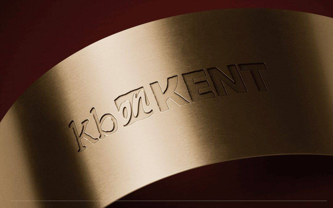
Kb on Kent
This farm to table restaurant in Lindsay has become a key project for us, with metrics that back up our work!
No Results Found
The page you requested could not be found. Try refining your search, or use the navigation above to locate the post.
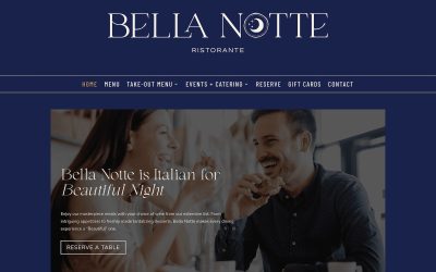
Bella Notte Restaurant Web Design
Bella Notte wanted to show off their new brand, book their private spaces, and showcase their menu. We pulled together their wish list, and voila!
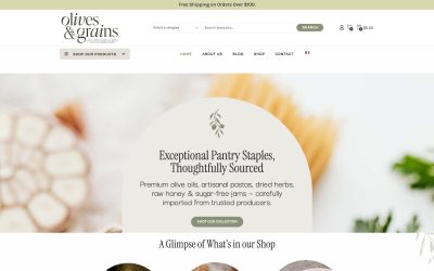
Olives & Grains – E-Commerce Website
Three sisters from Montreal have traveled the world and brought back the best pantry staples and foods from around the world…
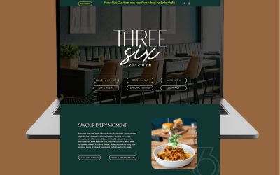
Three Six Kitchen – Website
After their rebrand, Three Six Kitchen worked with us to continue their new look onto their online platforms.
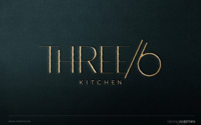
Three Six Kitchen – Branding
When Three Six Kitchen was ready to refresh their look, we worked with their interior designer to create a cohesive look – inside and outside.

Obsidian Design Studio – Branding
Rachel thought she might just want a word mark logo – but once we saw how well her monogram letters came together – we knew it had the potential to become iconic.
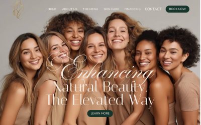
RNRC Aesthetics – Web Design
Rochelle came to us for Google Ads support, but she wasn’t confident that her website could convert cold traffic. So we worked with her to elevate the look – allowing her to confidently raise prices, and run ads with pride in her brand.

Should You Use the Colour Blue In Your Brand?
When it comes to branding, the colour blue is often associated with trust, reliability, and stability. Some of the biggest brands including IBM, Microsoft, Bank of America and Facebook use blue as their primary brand colour. What is it about this colour that makes it...
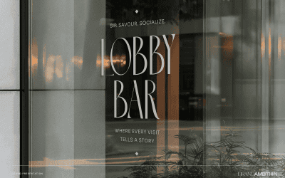
Lobby Bar – Branding
This project was brought to us by a returning client who has been active in the revitalization of downtown Oshawa. The Lobby Bar is the newest development, and part of the landmark 95 King building.

Ecoplas – Industrial Rebrand
This Bowmanville company has had a successful business for years, but as more of their product line enters the medical field, they decided they needed a brand that would look clean and crisp to their medical partners – without turning off industrial clients.
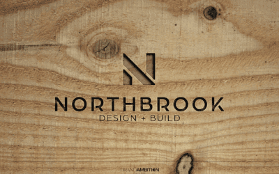
Northbrook Design & Build – Branding
This contractor has grow their business for years through referrals – reflecting their high quality work. Now they are ready to seek out higher value projects, and work more with architects and designers. We gave them a brand that still feels like
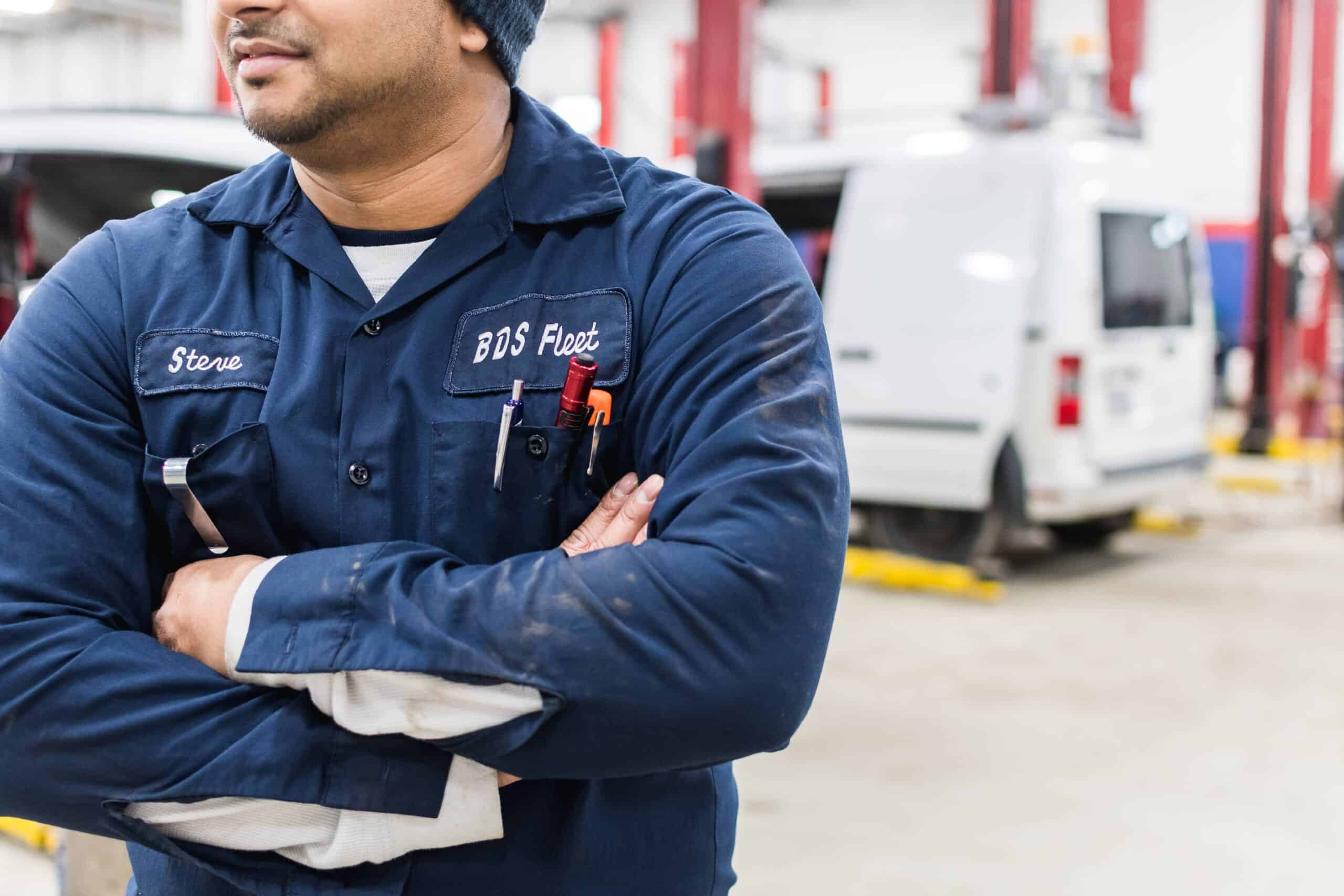
BDS Fleet – Photoshoot
It's not uncommon for business owners in the skilled trades to think that they don't need a photoshoot - or that this is a wasted business expense. That's why we love this project so much! It really shows the value that a company can get from professional photography,...

Kim Keller – Marketing Plan
We matched this realtor’s personality and sales style with a visual content strategy designed to amplify her brand and message.

Braden Wheatcroft – Branding
Brokerage owner and real estate coach, Braden Wheatcroft needed to build a visual identity around his podcast, social, free downloads and more. Could we create a brand that would unite all his different initiatives?

Timeless Spaces – Branding
A tall font was in order for this brand to keep the logo condensed, but still elegant. What do you think?
Jasmin Felix – Realtor – Branding
This realtor is going out on her own after a long term business partnership. Could we give her the visuals to feel truly confident in her new launch?
Ridgeview Dental – Branding
This client asked for visuals that wouldn’t give people the dentist scaries. They wanted modern, soft, and welcoming…
Lumberjacks – Branding
The skilled trades need attractive brands to communicate trust and reliability. Would you trust this company?
Digital on Demand – Mini Brand
This young entrepreneur is launching her new digital courses and personal brand. Will these visuals be enough to cover both initiatives while linking them together?
Voyageur – Branding
Voyageur provides construction services and consulting on Ontario’s infrastructure. It’s very proud of its Aboriginal ownership and its commitment to sustainability and the environment.
Olive & Grains – Branding
Three sisters from Quebec have been working together to open an online grocery store. Could we give them a brand that would work for the shop as well as the packaging for their in-house product line?
Berry Hill Bistro – Branding
Located across from the art museum, this restaurant wanted a strong graphic presence that could call in audiences for lunch…
Dog Walk Happy – Branding
Dog Walk Happy is the leader of the pack! Their business is quickly scaling, putting the company at the forefront of everything from insurance issues to procedures for tracking pets. They asked us for a brand that says “Take us seriously as professionals”.
Olive Branch Psychotherapy – Branding
This psychotherapy clinic was built on compassion, collaboration, and creativity. They were looking for a brand that felt authentic, inspiring honesty and personal reflection.
Gaurika Angus – Commercial Interior Design
We met Gaurika when collaborating on a project, and immediately loved her talent. She felt that strategic branding would help her target more commercial clients, and we agreed!
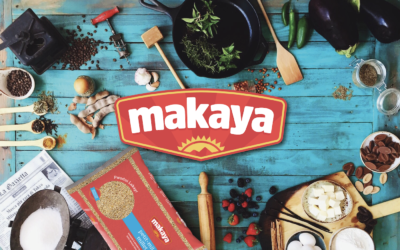
Makaya Haitian Food – Branding
Makaya specializes in Haitian food staples, and wanted to represent the island culture without making the foods feel “foreign” to locals. They also asked for colours and design that made the food feel accessible and affordable.
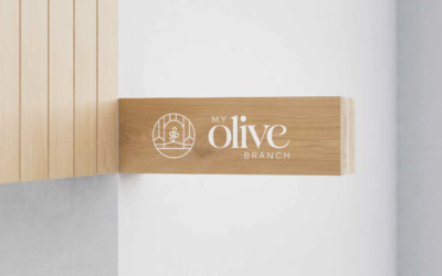
Olive Branch – Branding
This beautiful grocery store will be opening in Thornhill in the summer of 2024. As a fully kosher restaurant, we wanted this location to contain subtle references to its community.
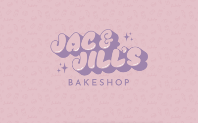
Jac N’ Jill Bakery – Branding
This brand was a local favourite at markets, and known for their macaroons. When they were ready to open their own store front we worked with them to create a brand straight from the early 90s.
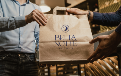
Bella Notte Restaurant – Branding
Bella Notte Restaurant has been a staple of Durham’s dining community for years. After the pandemic, they wanted a fresh start, celebrating their customers, their heritage and their future. Working with this upscale Italian restaurant was an honour!
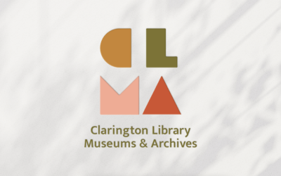
Clarington Library – Branding
The Clarington Library, Museum & Archives was in the middle of a web rebuild, when they realized they needed more design direction.
Avery Medical Recruiting – Branding
This medical recruitment firm had an existing logo, but felt like they lacked the visual identity they needed to communicate their ideal client. We worked with them to expand out a marketing plan that spoke to a higher-calibre client, and were delighted to hear that Avery experienced nearly instant results on LinkedIn.
Meechum & Whitney – Branding
This real world team brought their partnership to their business. We gave them a sophisticated and professional brand to balance out their youthful and fresh approach.
Kawartha Lakeside Realty Branding
This husband and wife team have been working the Kawartha cottage country. As they find increasing success on YouTube, they realized that having cohesive brand visuals would make them more recognizeable from one social platform to another