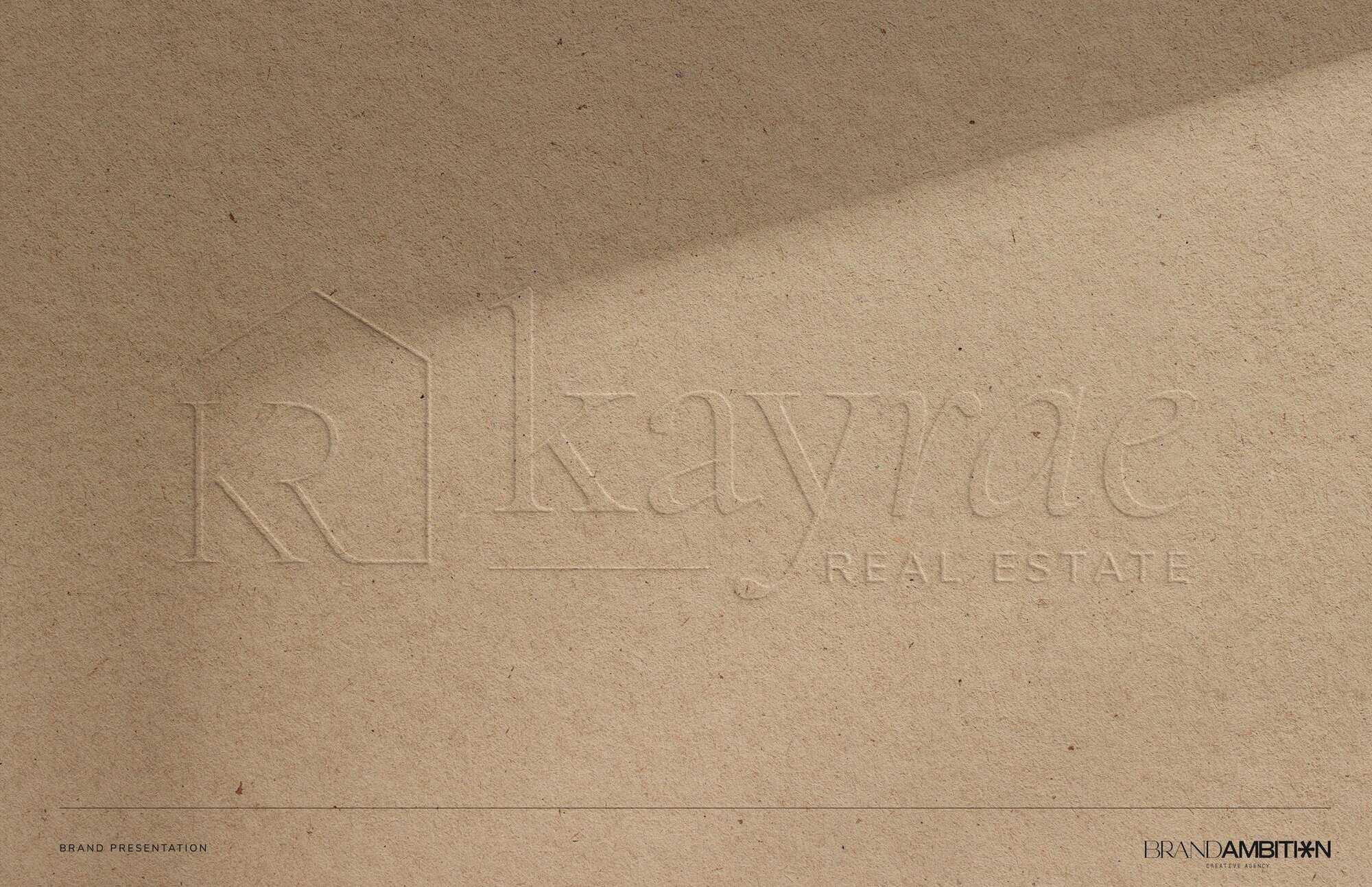
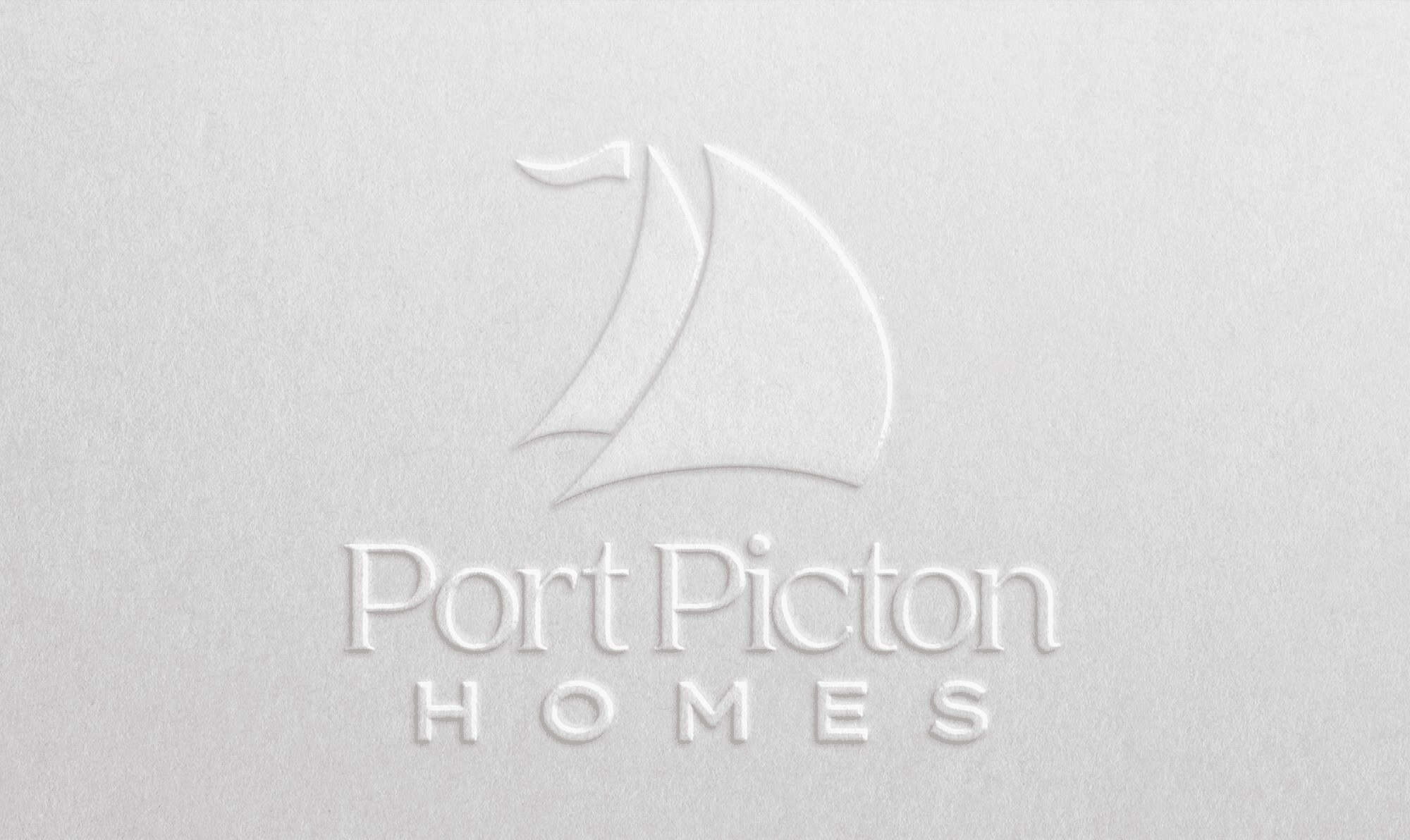
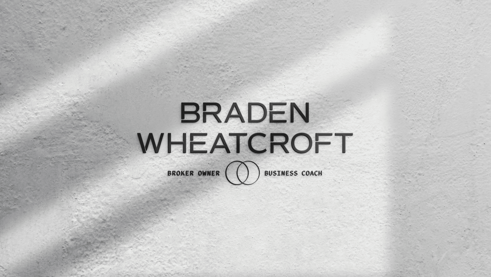
Realtor Jane Thuet


STORY:

Real estate agent Jane Thuet was looking for a gender-neutral, black and white brand. Thanks to a great team name, we were able to create this sleek, attractive look that will draw both clients and talented agents to grow the brand.

SERVICES:

Branding 

bragg-farm-logo

Tour More of Our Work!

Gaurika Angus – Commercial Interior Design

We met Gaurika when collaborating on a project, and immediately loved her talent. She felt that strategic branding would help her target more commercial clients, and we agreed!

Makaya Haitian Food – Branding

Makaya specializes in Haitian food staples, and wanted to represent the island culture without making the foods feel “foreign” to locals. They also asked for colours and design that made the food feel accessible and affordable.

Olive Branch – Branding

This beautiful grocery store will be opening in Thornhill in the summer of 2024. As a fully kosher restaurant, we wanted this location to contain subtle references to its community. 

Jac N’ Jill Bakery – Branding

This brand was a local favourite at markets, and known for their macaroons. When they were ready to open their own store front we worked with them to create a brand straight from the early 90s.

Bella Notte Restaurant – Branding

Bella Notte Restaurant has been a staple of Durham’s dining community for years. After the pandemic, they wanted a fresh start, celebrating their customers, their heritage and their future. Working with this upscale Italian restaurant was an honour!

Clarington Library – Branding

The Clarington Library, Museum & Archives was in the middle of a web rebuild, when they realized they needed more design direction.

Avery Medical Recruiting – Branding

This medical recruitment firm had an existing logo, but felt like they lacked the visual identity they needed to communicate their ideal client. We worked with them to expand out a marketing plan that spoke to a higher-calibre client, and were delighted to hear that Avery experienced nearly instant results on LinkedIn. 

Meechum & Whitney – Branding

This real world team brought their partnership to their business. We gave them a sophisticated and professional brand to balance out their youthful and fresh approach. 

Kawartha Lakeside Realty Branding

This husband and wife team have been working the Kawartha cottage country. As they find increasing success on YouTube, they realized that having cohesive brand visuals would make them more recognizeable from one social platform to another 

Sociability Party Planner – Branding

Started by two friends, this company is designed to make parties accessible to children with special needs. Party rentals and planning includes accommodations by experienced staff to make celebrations safe and fun for everyone!

Jewel of the Lotus – Branding

As part of our premium package for JAM Designs, we created more than 120 custom labels for across several product lines. Mockups were used on the website, and on social media…

JAM Designs Re-Brand

We helped JAM capitalize on their biggest opportunity, and organized their business into a brand family, bringing order, professionalism and consistency to the business. 

Parkwood Estate Rebrand

Branding this project meant walking the line between the heritage of the site and the need to leverage social media to promote programming and attract young audiences. 

Search Engine People Agency Branding

This Toronto PPC & SEO Agency has risen within the industry. But over the years their visual identity had drifted. Without guidelines, much of their print, website and presentations were not consistent in appearance. As their ideal client evolved…

Dina Luxury Real Estate Brand

This brand for a Montreal realtor, needed to feel upscale, reflecting the luxury properties that Dina specializes in. We focused on trending neutrals and exotic…

Simple Life Homes – Branding

Simple Life Homes has been building prefabricated residential homes in Eastern Ontario for years. As their business has developed, they have moved into multi-residential, multi-story & commercial building applications. As their ideal client has shifted from direct to consumer to architects and builders, they knew…

Irving Heating & Cooling HVAC Brand

This heating & cooling company wanted to come into the marketplace against competitors who had been around a long time. This fresh, crisp look capitalizes – making “new” synonymous with professional, clean and modern. 

Iron Butterfly – Interior Designer Branding

After a major life transition, interior designer Jolene became facinated by meditation and a more spiritual daily practice. She combined this personal passion with her professional expertise to create Iron Butterfly.

Double Shot Agency -Branding

This talent agency’s empowering messaging leaves no room to be shy. So this branding project embraced a bold and unflinching attitude down to the last detail.

Brent Anderson – Real Estate Team – Branding

This brand is unique in the lengths they went to to compliment their brokerage’s branding. Click through to see how this subtle but impactful brand came together.