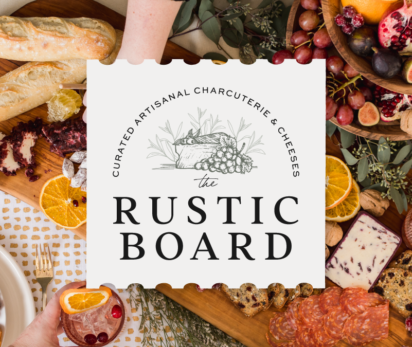
The Rustic Board STORY: We always LOVE working with food brands, and so we were delighted when we were approached by The Rustic Board. Nicole has a full-time job and has been exploring branching out into her passion – charcuterie. We knew a hand-illustrated logo...
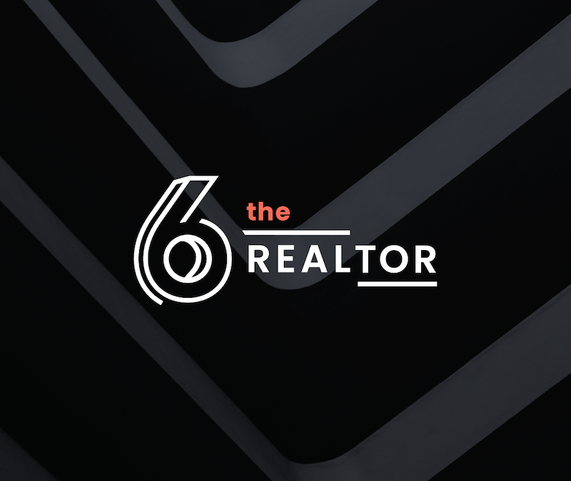
Shameer Arain Realtor STORY: Shameer was looking for a sleek and sophisticated brand to help position him as a leading Toronto realtor. We chose predominately black and white visuals with strong architectural influences to give power and elegance to his business, and...
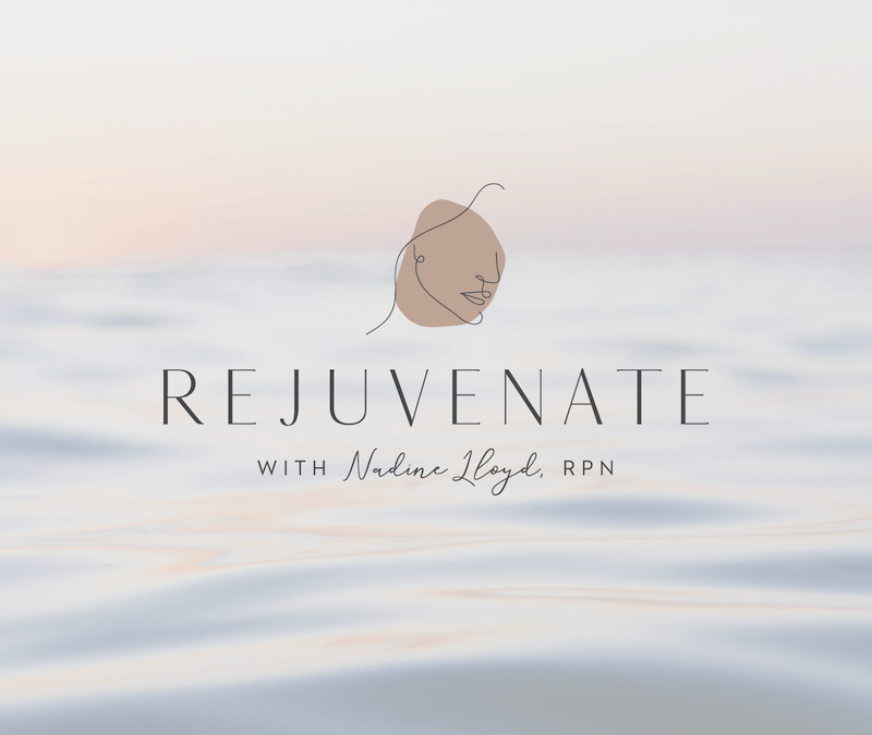
Rejuvenate Spa & Fillers INSPIRATION: We gave Nadine Lloyd a modern, clean look, utilizing a very trendy line art in the logo. She wanted the brand to feel upscale, simple and peaceful. This beauty service is truly beautiful. SERVICES: Branding, photoshoot,...
Hart’s Espresso Bar STORY: Hart’s Espresso began as a mobile service, but recently opened its first location in Bowmanville and needed to update its look to match its high-end coffee culture experience. SERVICES:...
Nicholls & Associates STORY: This brand has a long history in its industry. Now that the company has passed from its founder to a new generation of designers we helped give it. new look, while paying homage to its traditions and heritage. SERVICES: Branding,...
Realtor Jane Thuet STORY: Real estate agent Jane Thuet was looking for a gender-neutral, black and white brand. Thanks to a great team name, we were able to create this sleek, attractive look that will draw both clients and talented agents to grow the brand....

 July 11, 2026This farm to table restaurant in Lindsay has become a key project for us, with metrics that back up our work! […]
 July 11, 2026A vintage vibe was the perfect fit for this iconic cottage country ice cream shack. […]
 July 11, 2026Vibrations are everything, especially when it comes to the Elova candle. As each candle is poured, healing frequencies are played. […]
 April 6, 2026Ridgeview Dental wanted a website that showcased the culture of the clinic, so that new clients could separate them from the pack. […]
 February 28, 2026