When delivering branding projects, we almost always use the one concept method. This is a streamlined, and more focused approach to completing a brand. But it’s a process we developed through trial and error.
PROBLEM:
In our early years, we used to present the client with 3 different logo options. They would choose one, and then we would build out the rest of the brand. Unfortunately, this delivery style presented several challenges. First, clients couldn’t see the full brand story in a simple logo. So they often pressed us to add more elements, and we could get trapped in several rounds of revisions on JUST the logos before even advancing to the rest of the brand. Clients often also felt compelled to “Frankenstein” two very different logos together. This often created mashup styles that weren’t as impactful.
![]()
SOLUTION:
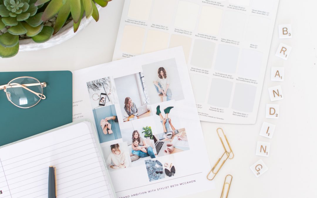
After some initial nervousness, we decided to try ONE logo concept. This meant that after a mood board was approved we designed the ENTIRE brand. Business cards, social media posts, everything! We presented the full PDF and walked clients through the presentations.
THE RISK:
This approach can be scary. Nothing makes your heart sink faster than opening a presentation, and having the client say “I hate it”, and you still have several pages of visuals to go. If the client dismisses the brand, it also means starting again from scratch which is a big time investment. Is it worth it?
YES.
The one concept method meant that clients could see the full brand story told throughout the entire project. This encouraged them to take a more macro perspective. It made clients less critical of unimportant details. Instead of fixating on the shape of a letter in the logo, they embraced the entirety of the brand concept. Emotionally significant elements could be placed throughout the body of work, and used tastefully in collateral pieces. Clients were less compelled to “over-stuff” their logos. Finally, it really helped clients who “couldn’t see” how things would roll out. If you have ever heard a client say “I don’t know what I like, but I’ll know when I see it,” you know that you are working with a visual person, and they are going to have to have concrete examples to review. Nearly all of our clients respond better to this new system. Overall, our approval rating jumped to over 80%, with most revisions just small alterations to the business card details.
CAUTIONS:
To implement the one concept method properly, it’s crucial that you really take your time in the mood board stage. Probing, strong questions really matter. We recommend asking clients lots of WHY based questions.
“Why don’t you like this? Is the colour wrong but the shape is okay? Is it too busy? Do you think if this was calmer you would like it more?”
Asking them how certain images make them feel, if the colour palette is consistent with the mood of their business, or if they can see themselves using these elements on printed materials, will all help the client commit to the direction or get clear about changes they would like to see.
Since converting to the one concept method, we have never switched back. Our clients are much happier, and processes and workflows run much smoother. We highly recommend it!
![]()