
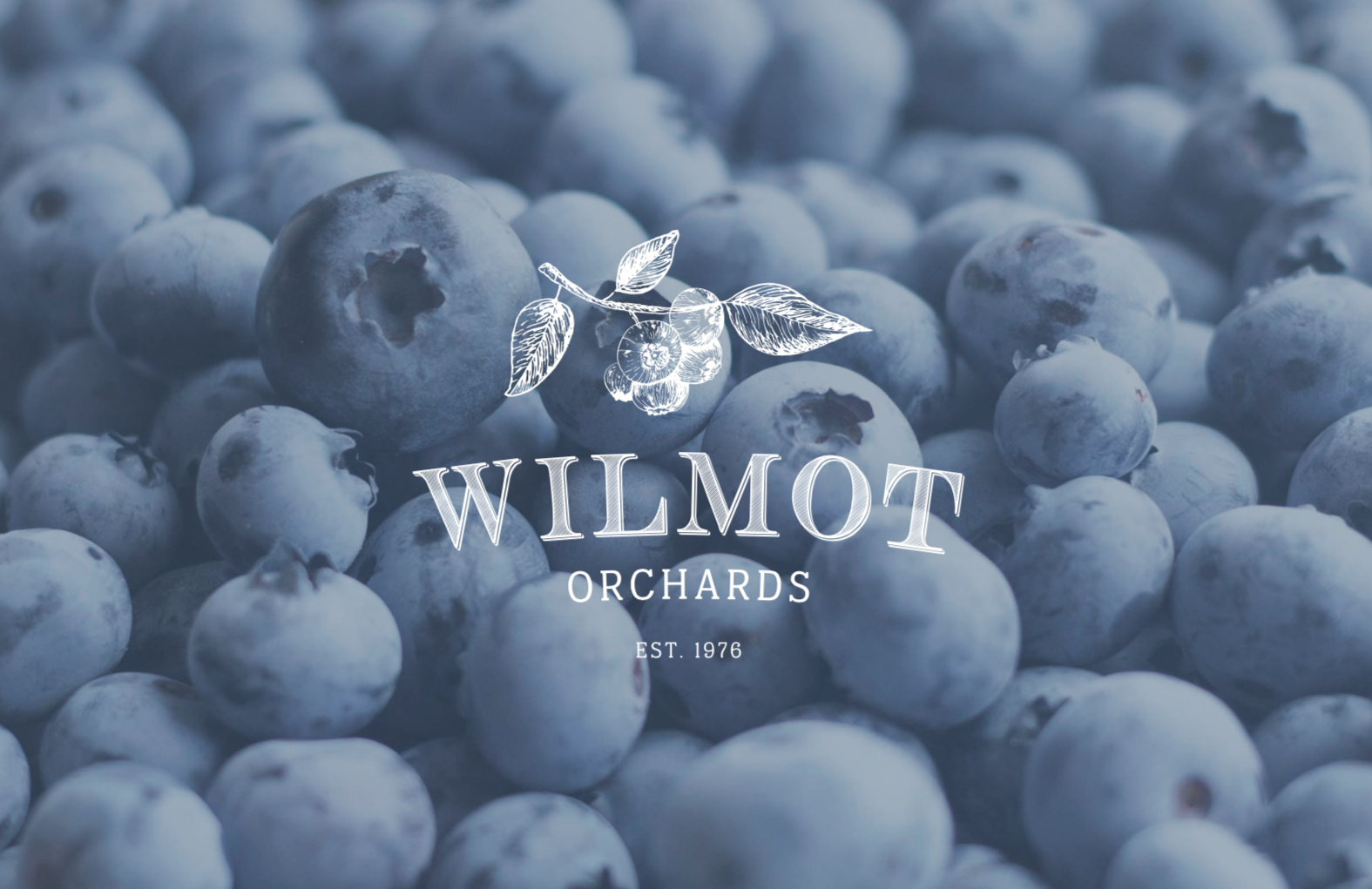
Wilmot Blueberry Orchard
INSPIRATION:
Like many farms and orchards, this was a family business, and as management of the company passed to a new generation, it became a priority to update and modernize the company’s visuals. We wanted to do this in a way that honored the heritage of the orchard, and didn’t drift too far from previous designs, but still offered a brand refresh.
SERVICES:
Branding, Website, Additional Graphic Design


")
")
See What Else We've Been Working On...
Iron Butterfly – Interior Designer Branding
After a major life transition, interior designer Jolene became facinated by meditation and a more spiritual daily practice. She combined this personal passion with her professional expertise to create Iron Butterfly.

WolfDen – Fitness Program Photoshoot
There is business strategy and a great human story behind this photoshoot for WolfDen Fitness. Some of the women in this shoot have lost more than 40 lbs, and have used this empowering day as a motivator and celebration of their hard work. But these images will also inspire others to join WolfDen’s mission…

Top Podcasts We Recommend for Entrepreneurs
Entrepreneurship is a challenging but rewarding journey. One of the things that has provided me the greatest comfort when things aren't going well, is listening to other business owners sharing their stories. Hearing that I am not the "only one" experiencing certain...

Should You Use the Colour Blue In Your Brand?
When it comes to branding, the colour blue is often associated with trust, reliability, and stability. Some of the biggest brands including IBM, Microsoft, Bank of America and Facebook use blue as their primary brand colour. What is it about this colour that makes it...

5 Shopify Plugins for your Cart Page
One of the fastest ways to increase revenue in an e-commerce business is to introduce an upsell. Luckily, if you have a Shopify website, there are countless plugins and apps that can help you do that. Here are a few of our favorites: CartHook: CartHook is an app that...
Increasing Revenue: How to Make More Per Purchase
The "easiest" way to increase revenue is to increase prices. But it's not the ONLY way that you can raise the value of a customer purchase. Here are 4 additional options to consider if you are looking for ways to make more money in 2023. Offer higher-priced options:...

Double Shot Agency -Branding
This talent agency’s empowering messaging leaves no room to be shy. So this branding project embraced a bold and unflinching attitude down to the last detail.

Brent Anderson – Real Estate Team – Branding
This brand is unique in the lengths they went to to compliment their brokerage’s branding. Click through to see how this subtle but impactful brand came together.

Holiday Product Photography
OCTOBER 27th & 28th (Thurs. & Fri.) Do you have all the tools you need to promote your products during the holidays? In partnership with Picks & Giggles markets, we are offering a bulk product session to help you save costs during the holidays. With a...
Join Our Next Collaborative Shoot
A ROMANTIC COFFEE SHOP... Our August styled shoot will be at the trendy and visually stunning ROAM Coffee in downtown Bowmanville. Join us, and through the power of collaboration, you can get an upscale, beautiful shoot for a fraction of the price! We can make this...