Oriyomi – Real Estate Development – Branding
STORY:
These real estate developers build and maintain condos throughout the Toronto area. Motivated by an aggressive growth strategy, this group is hoping to build 12 units a year for the next 10 years. Their ability to scale will require them to attract sophisticated young couples to their properties. We gave them a mature, classic look with a touch of eastern influence.
SERVICES:
Branding, website


See What Else We've Been Working On...
East City Candles – Branding
This brand was designed to match up with the nostalgic photography and colour palettes of Laurel’s work. An early break from the bright watercolour shades that were popular at the time, it is filled with personal meaning and will always be special to our team.
Sherry Zwetsloot – Realtor – Photoshoot
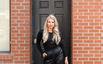
This shoot for real estate agent Sherry Zwetsloot was inspired by “The Devil Wears Prada” because we couldn’t resist Sherry’s sharp wardrobe and strong boss-lady vibes! Shot half in our studios, and half in beautiful downtown Cobourg.
Redefined Finds – Branding
Re-defined Finds INSPIRATION: This successful shop has been in business for several years and was celebrating by updating her interior decor. We were so thrilled when her interior designer at The Inspiration Nest recommended us to update her brand to match! Nominated...
Rolling Grape – Vineyard Branding
We created the brand, labels, and website, and have been a long-term collaborator with this family-owned farm.
Jennifer Langille – Remax Agent – Photoshoot
This very successful Remax agent came to us to further establish her personal brand. Her photoshoot followed simple guidelines with a simple, uncluttered look that would compliment her Instagram aesthetic.
Uniquely Whynot – Cricut Organizer – Photoshoot
We loved helping this company go from side hustle to serious brand, with a professional photoshoot showcasing their Cricut tool organizers. Is your craftroom ready for this level of organization?
Derek Baird Team – Branding
Derek Baird is passing his very successful real estate team to his sons. We worked with them to collaborate on an updated modern brand that paid homage to their dad’s legacy. These remain some of our favorite shoots ever, with images that are now on billboards across their local area.
Stonehouse Staging – Branding
It was a stroke of genius when our designer came up with the simple hand-drawn house logo. It looks like something that is on every family refrigerator door, and it warms our hearts. This brand channels HOME, just like Jill’s magical syle.
Stonehouse Staging -Photoshoot
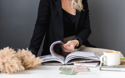
As the exclusive staging company for The Nook Realty, this team of ladies brings style, fashion, and a unique sense of home decor to Nook listings. We wanted to bring that same energy to their shoot. Luckily, it’s easy to capture their creative natures and see how much they love working together.
The Rustic Board – Charcuterie Brand
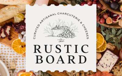
We knew a hand-illustrated logo was a MUST to match this brand’s “rustic” vibes. And of course, we recommended that a charcuterie company have a photoshoot so that we could play with all that yummy food!

