This client is in the process of taking her side hustle and passion into a real business. We worked with her on her branding, including hand-illustrated logos, and were so glad that she decided to move forward with a photoshoot. These images are lighting up her...
Stonehouse Staging INSPIRATION: This brand was all about clean lines, simplicity, and family. So it was a stroke of genius when our designer came up with the simple hand-drawn house logo. It looks like something that is on every family refrigerator door, and it...
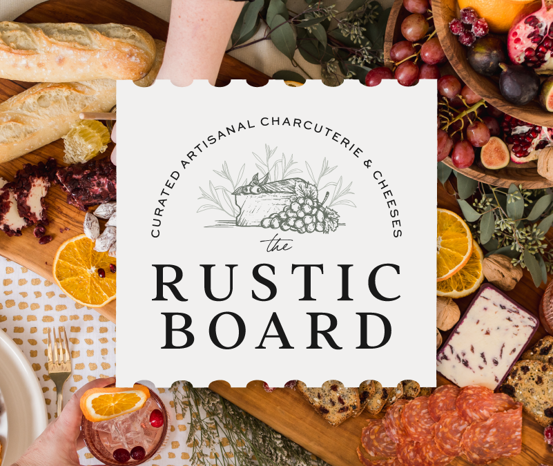
The Rustic Board STORY: We always LOVE working with food brands, and so we were delighted when we were approached by The Rustic Board. Nicole has a full-time job and has been exploring branching out into her passion – charcuterie. We knew a hand-illustrated logo...
Shameer Arain Realtor STORY: Shameer was looking for a sleek and sophisticated brand to help position him as a leading Toronto realtor. We chose predominately black and white visuals with strong architectural influences to give power and elegance to his business, and...
Rejuvenate Spa & Fillers INSPIRATION: We gave Nadine Lloyd a modern, clean look, utilizing a very trendy line art in the logo. She wanted the brand to feel upscale, simple and peaceful. This beauty service is truly beautiful. SERVICES: Branding, photoshoot,...
Hart’s Espresso Bar STORY: Hart’s Espresso began as a mobile service, but recently opened its first location in Bowmanville and needed to update its look to match its high-end coffee culture experience. SERVICES:...
The Downtown Business Improvement Association of Orono has a mandate to support local business and attract new visitors to Orono. Orono has downtown attractions that are beginning to step into their own - including one of the largest antique shops in the province. They came to us to start building a visual identity that can be used to promote the town and make it memorable online. […]



 September 4, 2026The Downtown Business Improvement Association of Orono has a mandate to support local business and attract new visitors to Orono. Orono has downtown attractions that are beginning to step into their own - including one of the largest antique shops in the province. They came to us to start building a visual identity that can be used to promote the town and make it memorable online. […]
 August 26, 2026
 July 11, 2026This farm to table restaurant in Lindsay has become a key project for us, with metrics that back up our work! […]
 July 11, 2026A vintage vibe was the perfect fit for this iconic cottage country ice cream shack. […]
 July 11, 2026Vibrations are everything, especially when it comes to the Elova candle. As each candle is poured, healing frequencies are played. […]