Dr. Kirstie Griffiths –
BRANDING
STORY:
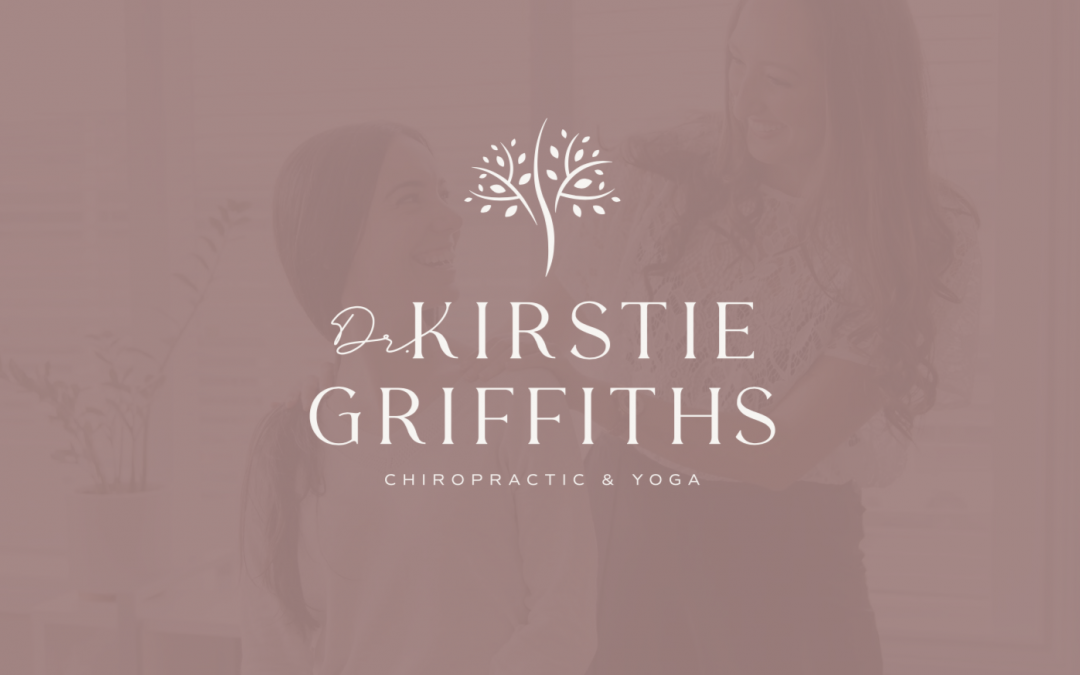
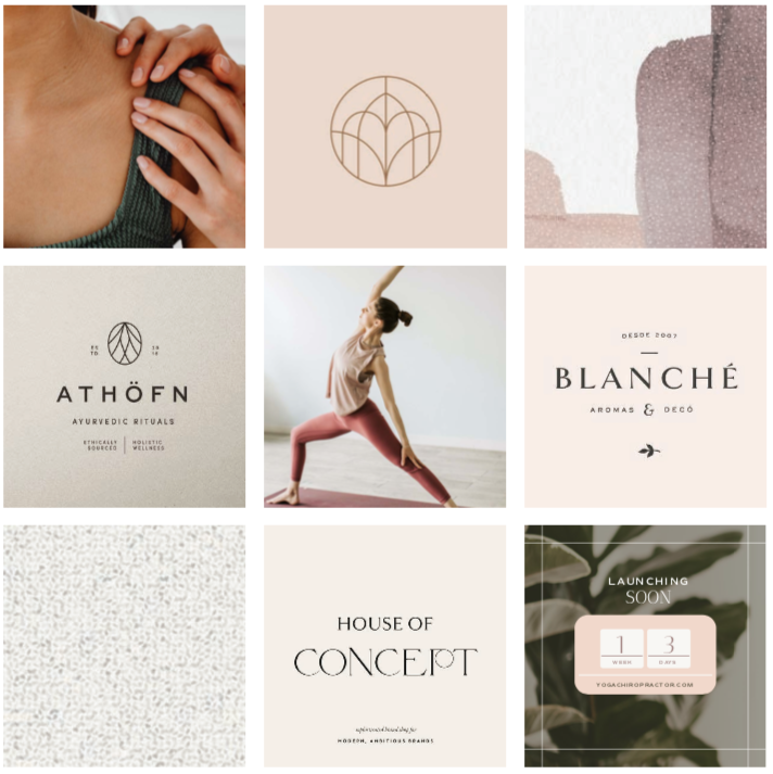
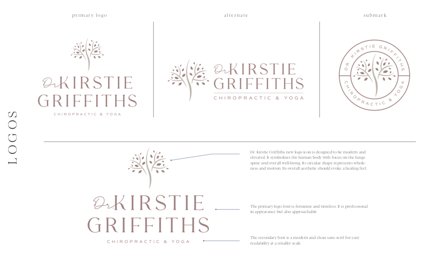
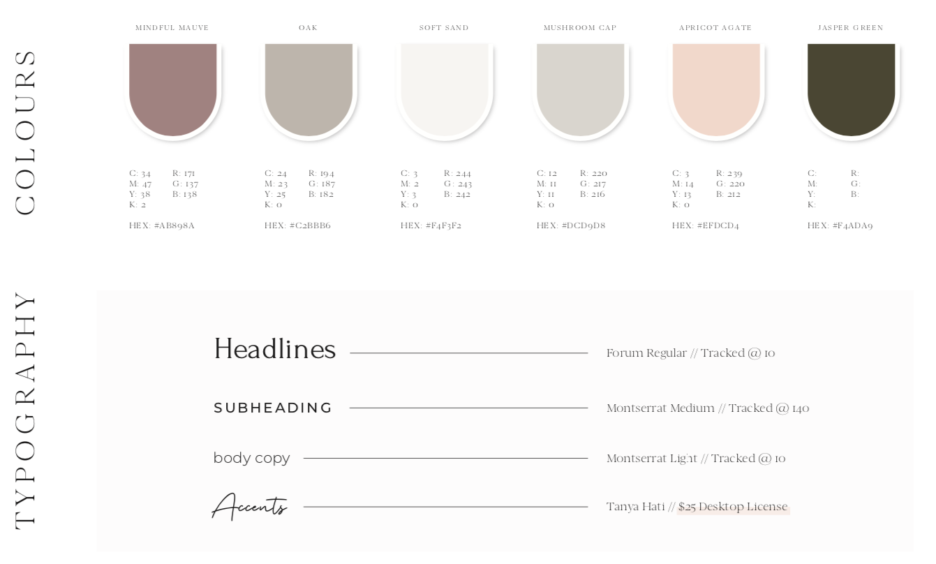
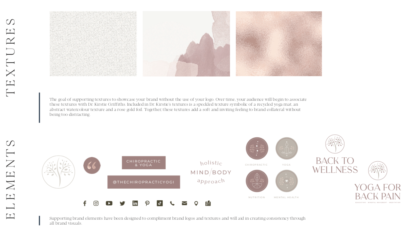
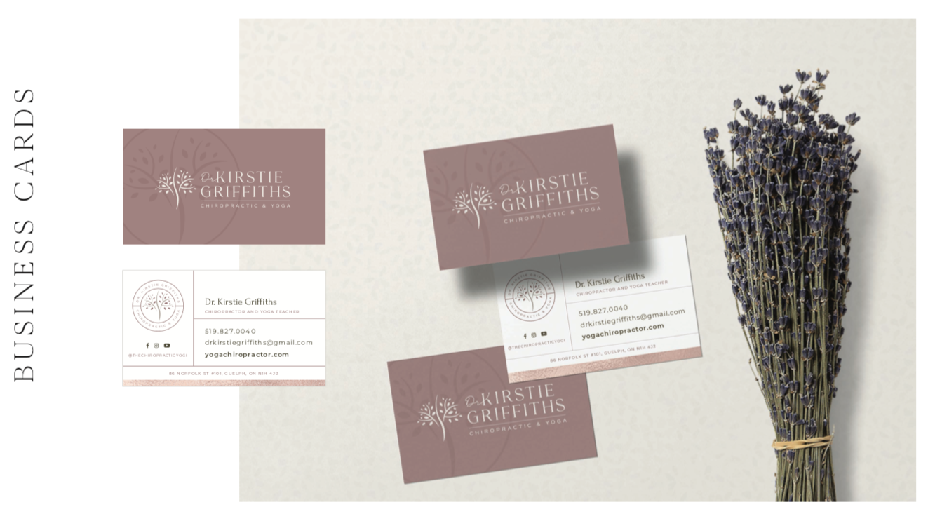
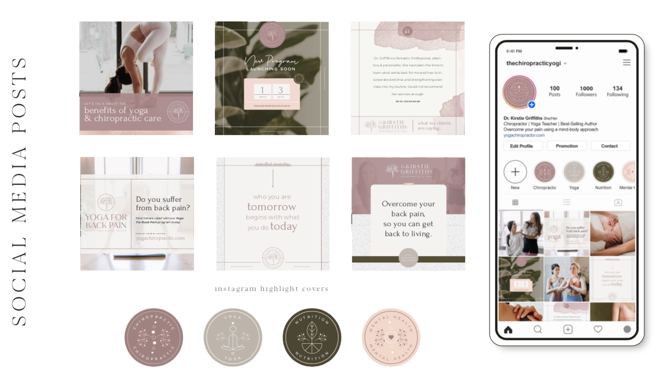
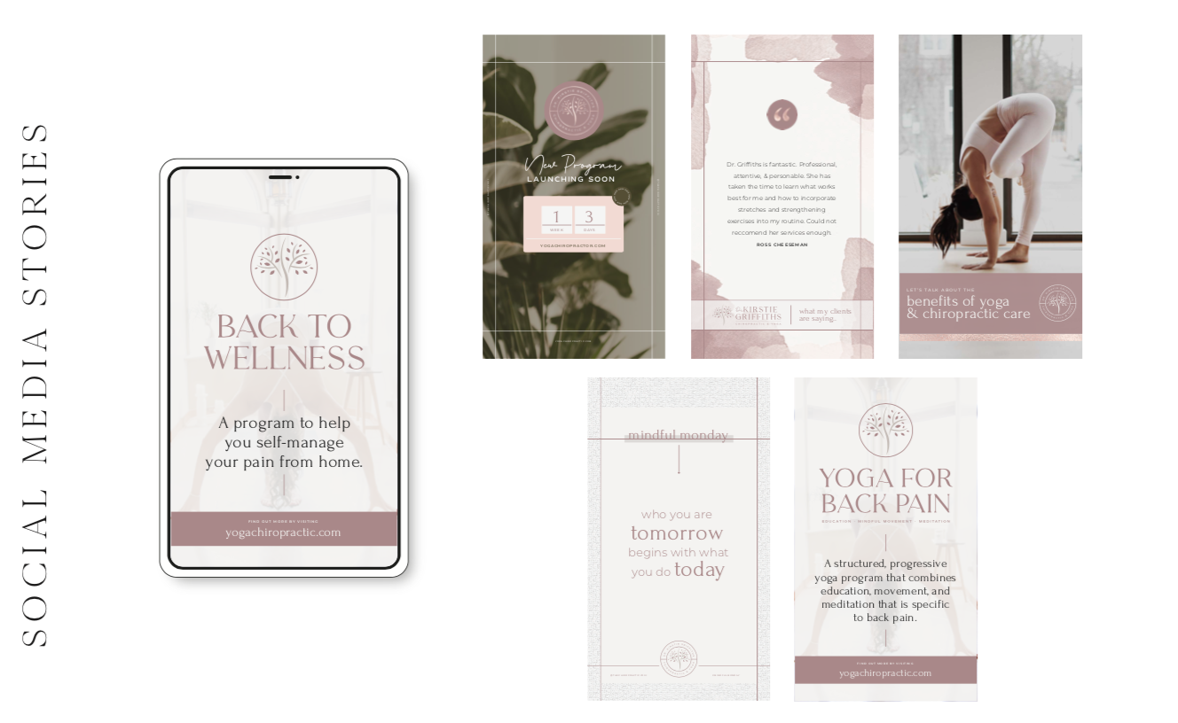
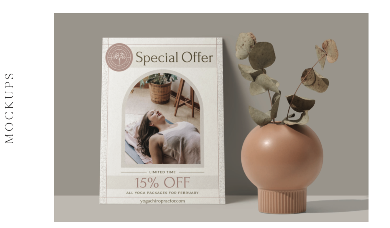
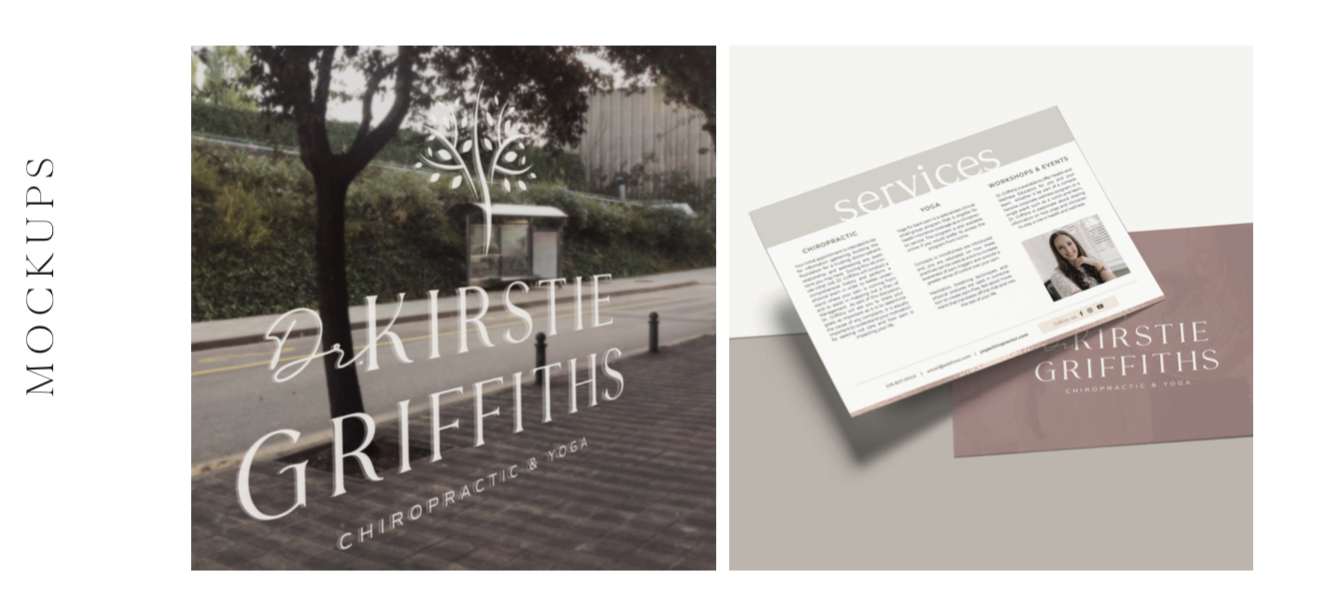
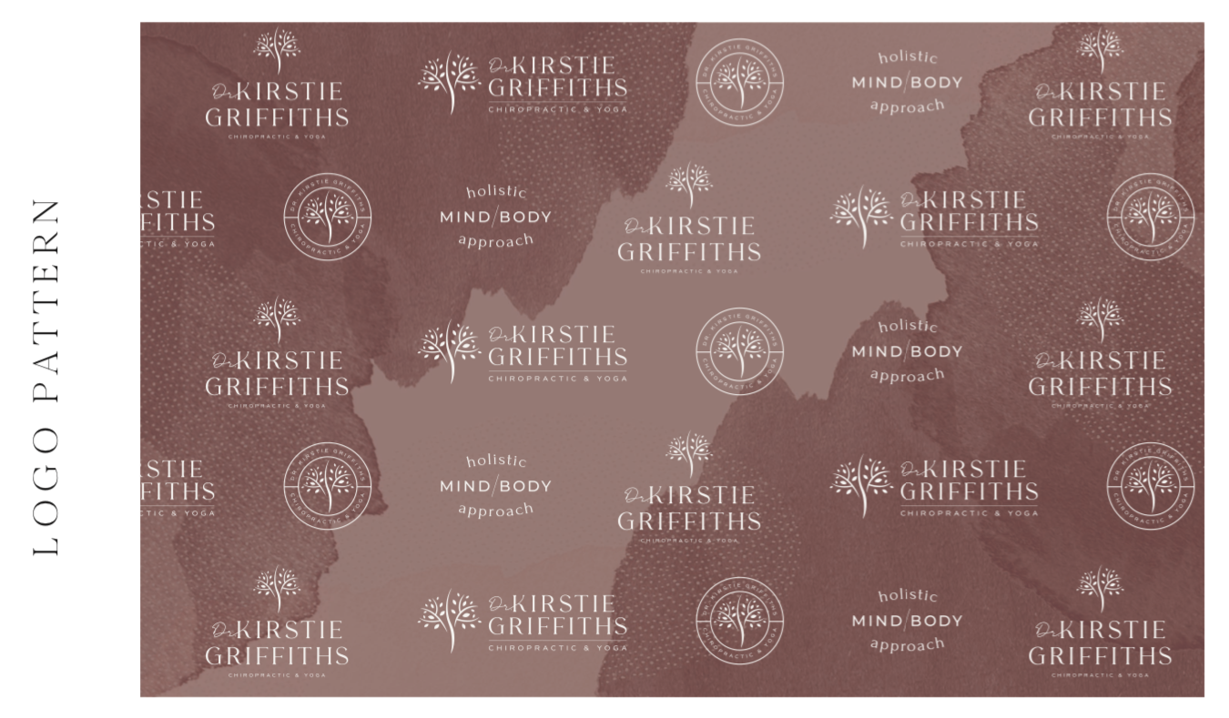
Dr. Kirstie had a long time logo that she was very attached to, but she knew it was looking aged. We worked with her to update the logo with new fonts and a softer approach to her icon. The end result is a modern and current look that prioritizes a lifestyle feel rather than a coldly clinical philosophy.
SERVICES:
Branding
See What Else We've Been Working On...
Birchview Design – Lifestyle Photoshoot
This design team from Peterborough has its eyes on growth! Exploring new business ventures and professionalizing their presence in their area are all 2021 goals.
This photoshoot will be the foundation of upgraded social media, website updates and new presentation decks for project pitches.
Shameer Arain – realtor brand
A sleek and sophisticated brand positions this professional as a leading Toronto realtor. Predominately black and white visuals with strong architectural influences suggest power with elegance. A punch of modern orange makes this aesthetic instantly recognizable.
Rejuvenate – Spa Brand
We gave this spa brand a modern, clean look, utilizing a very trendy line art in the logo. Nadine wanted the brand to feel upscale, simple and peaceful. This beauty service is truly beautiful.
Hart’s Espresso
Hart’s Espresso began as a mobile service, but recently opened its first location in Bowmanville and needed to update its look to match its high-end coffee culture experience.
Nicholls & Associates – Interior Designers
This well-established interior design firm is a leader in its industry. Nicholls & Associates has passed from its founder to a new generation of talent and It needed to be updated while keeping the look recognizable to its long-term clients. We helped to modernize its visuals while paying respect to its heritage.
Managing A Team During COVID-19
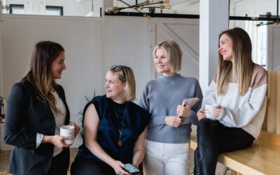
As a business owner, my great moments of satisfaction occur when I'm walking through the office while all my employees are hustling. I love the hustle and the energy. Seeing some people with headphones on, deeply focused on a project, while others are grouped around a...
Inner Circle Jane Thuet – Realtor Brand
Real estate agent Jane Thuet was looking for a gender-neutral, black and white brand. Thanks to a great team name, we were able to create this sleek, attractive look that will draw both clients and talented agents to grow the brand.
Online Clinic – Naturopathic Brand
This team of professionals in naturopathic medicine and natural health care are teaming up to create an online resource for clients. This bright, approachable and tech-friendly brand gives everyone access to holistic healthcare – no matter where they live!
John Shields Realtor Branding
This professional masculine real estate brand features a highly symbolic logo. The iconography includes a shield, a Superman symbol, and a men’s tie, all rolled into one!
Bathbomb Chick Rebrand
Bathbomb Chick RebrandINSPIRATION: This brand fully celebrates the modern Instagram aesthetic with playful colours, a touch of weirdness and some badassery for good measure. The font for this brand is inspired by a lipstick message on a bathroom mirror. Overall, we...

