Karen Gallagher
Fitness, Nutrition & Life Coaching
FITNESS COACH – BRANDING, PHOTOSHOOT & WEB
LOGO
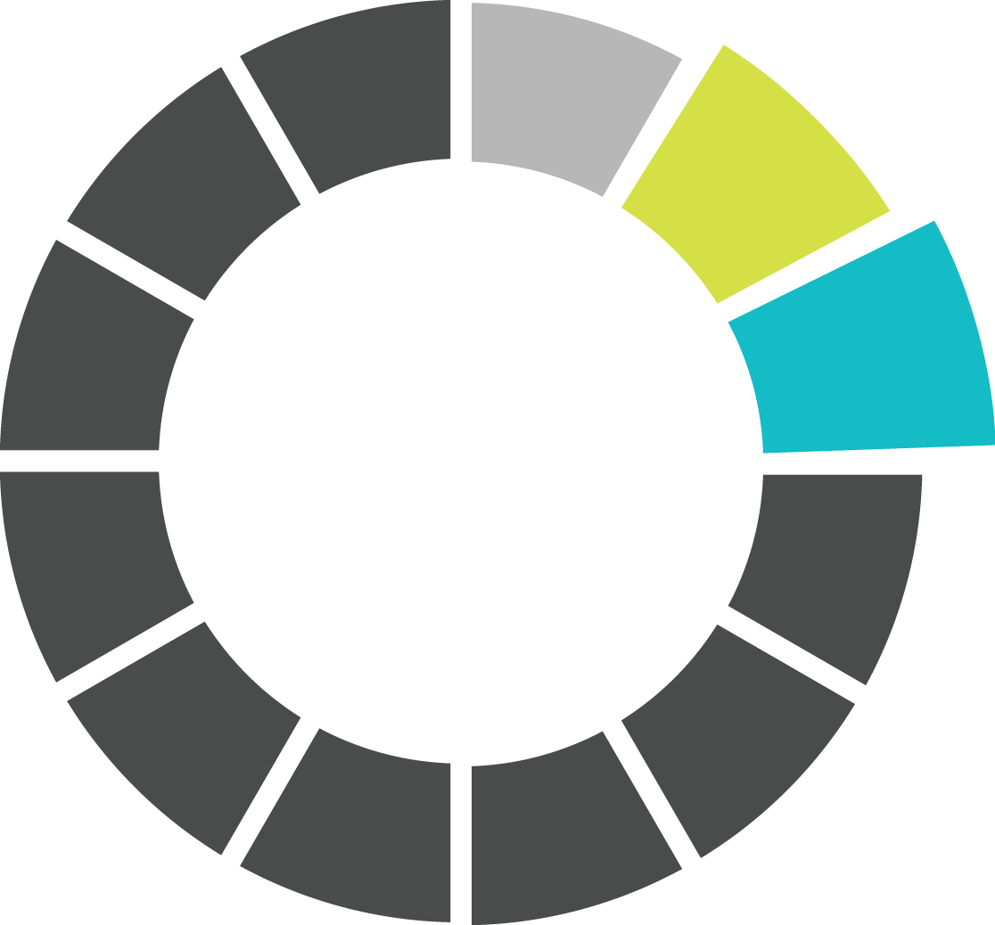
We created this logo to help reposition Karen from being a fitness coach to encompass her training as a life coach. The logo channels the “circle of life” that life coaches commonly use with clients to evaluate the various segments of their life. The logo was designed to show improvement and growth.
This element offers the ability to create custom circles for clients to show their state of life when entering and exiting the program to help measure progress. Until that time, it can be used as an element and watermark throughout Karen’s marketing materials.
COLOUR PALETTE
The colour palette is fun and feminine. The colours are reminiscent of the colours found in women’s gym equipment and work out outfits to make it easy for Karen’s photos to reflect her brand.

TEXTURES & PATTERNS
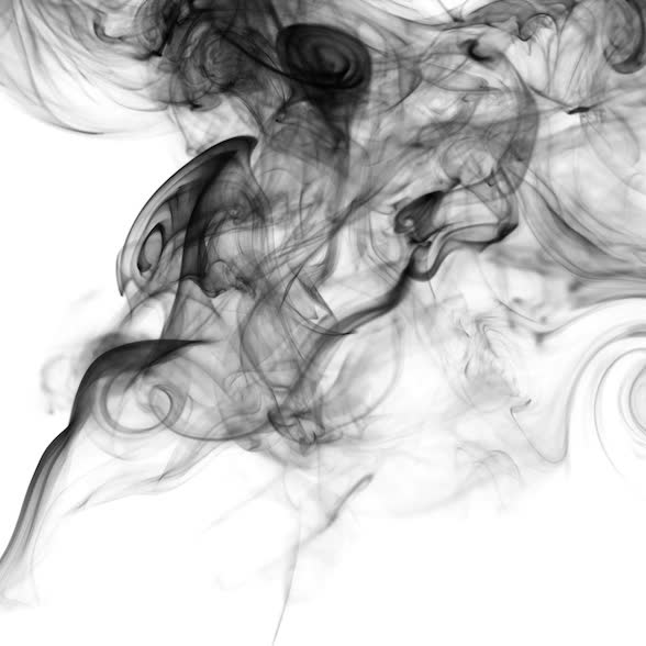
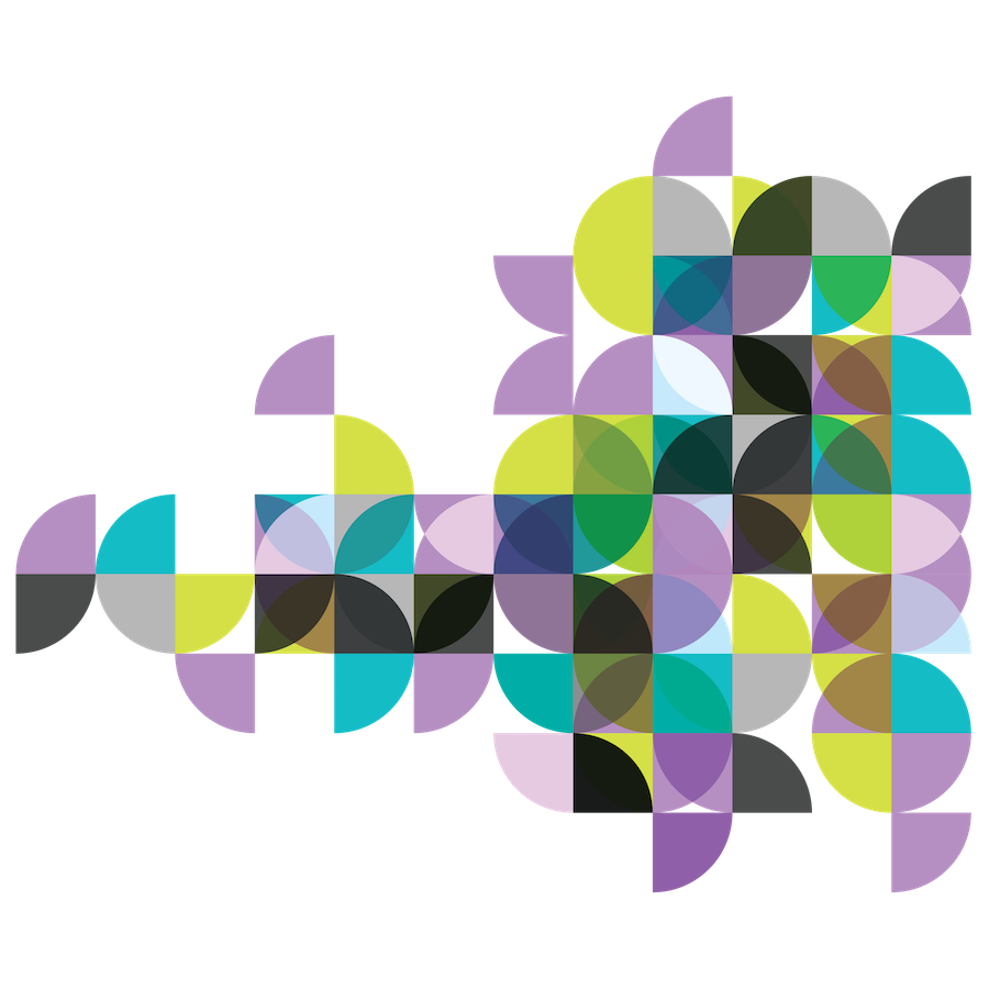
The vapor texture was created as a quick use background that can be altered to any of the colours in Karen’s brand. The puff of steam will remind those in the health and wellness community of essential oil diffusers. The circle pattern is one of our favorites. Based on round fitness balls, this pattern is unique, memorable and very flexible. It can be inserted over social media posts or into slide decks or ads to help establish brand recognition.
BRAND ELEMENTS
We gave Karen images of her tagline in 3 of her brand colours. These are easy to add on top of posters or images using basic phone apps to create branded posts or promotional materials.
The circle element from her logo can be supersized and faded out to create backgrounds for her website or print work. It can also be customized to reflect client evaluations. We proposed a social media campaign asking clients: “What does your vitality circle look like?” This inspires new followers to fill out a questionnaire to receive a unique image that indicates where improvements can be made in their lifestyle.


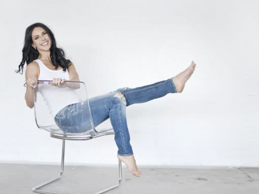
PHOTOGRAPHY
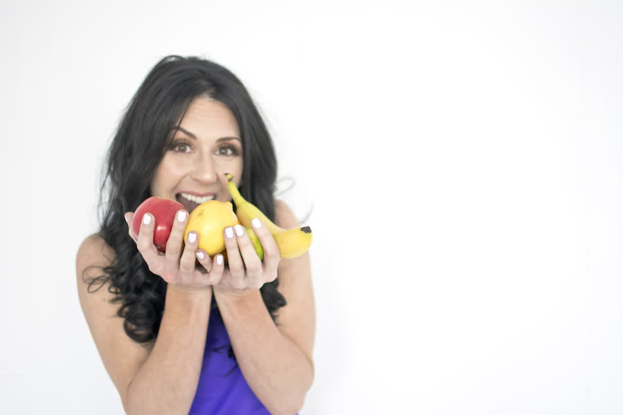
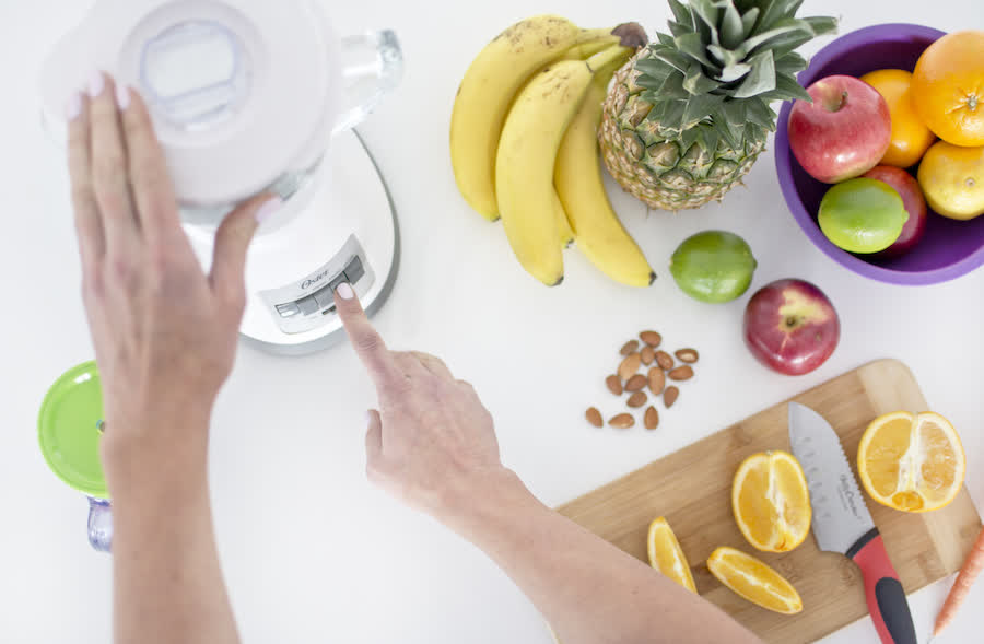
We gave Karen a bank of photography that showcased her personally. The strategy was to use them to create a collection of “authority posts” that would make her recognized as an expert in her field. We also gave her some custom images that could be used to promote her nutritional program. Moving forward Karen should cultivate a collection of photographs that are compatible with her color palette, bright and featuring white space so that copy can be added for social media.

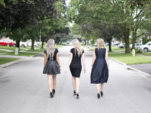
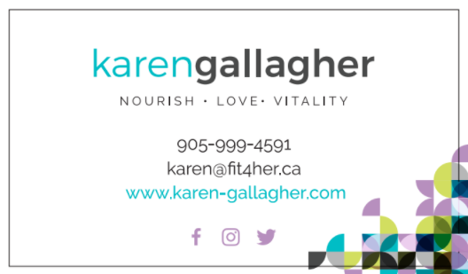
BUSINESS CARDS
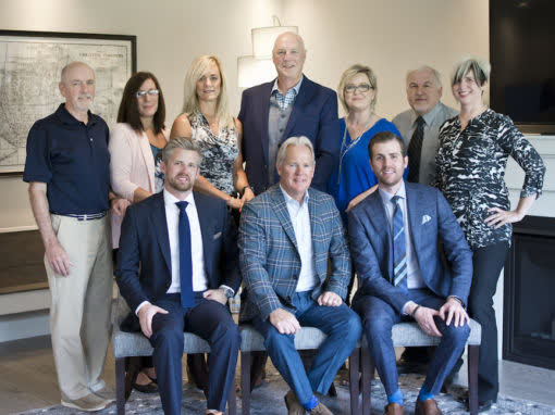
Each sister will have her own business card. The back of each will be the same with a group photo and the primary logo. The fronts of the cards will have each sister’s individual headshot and contact information, as well as their individual logo mark. The business cards are fun and colorful so they can stand out in a stack of cards.

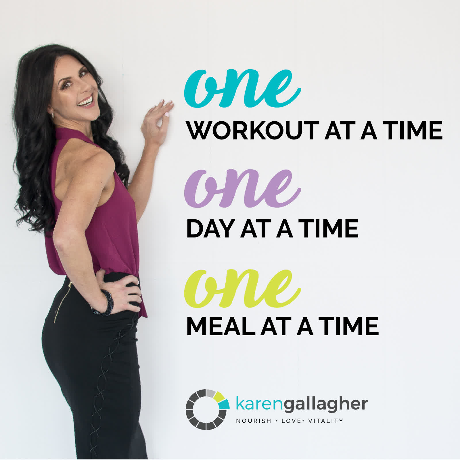
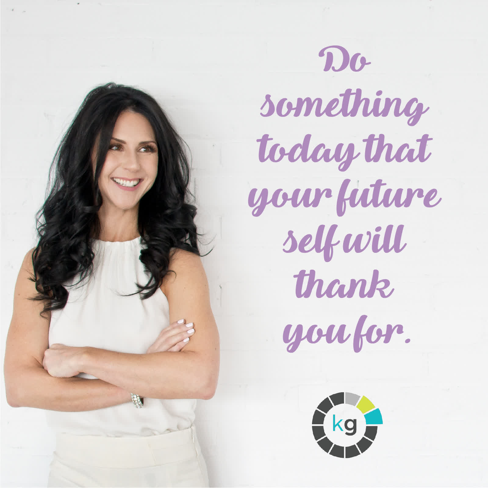
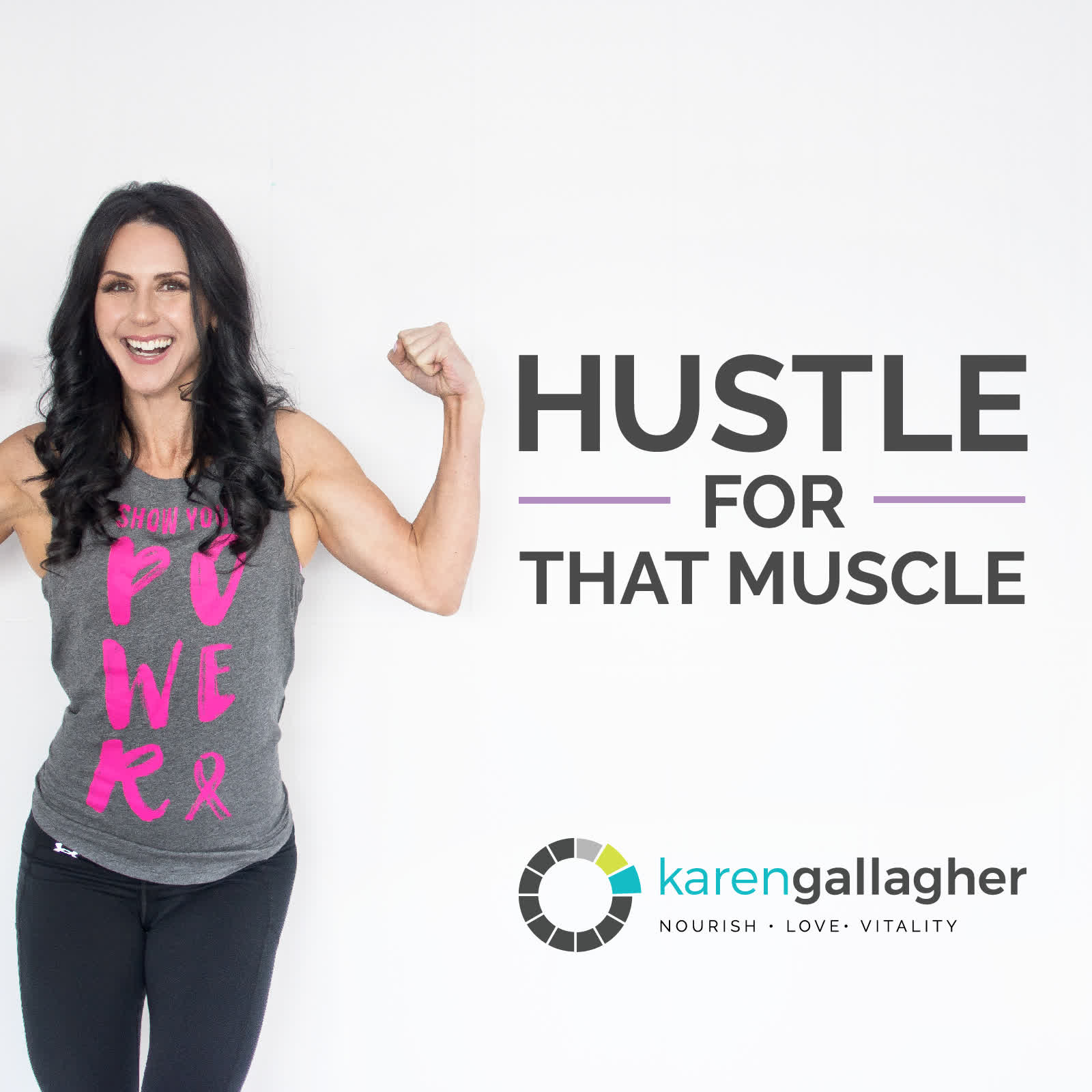
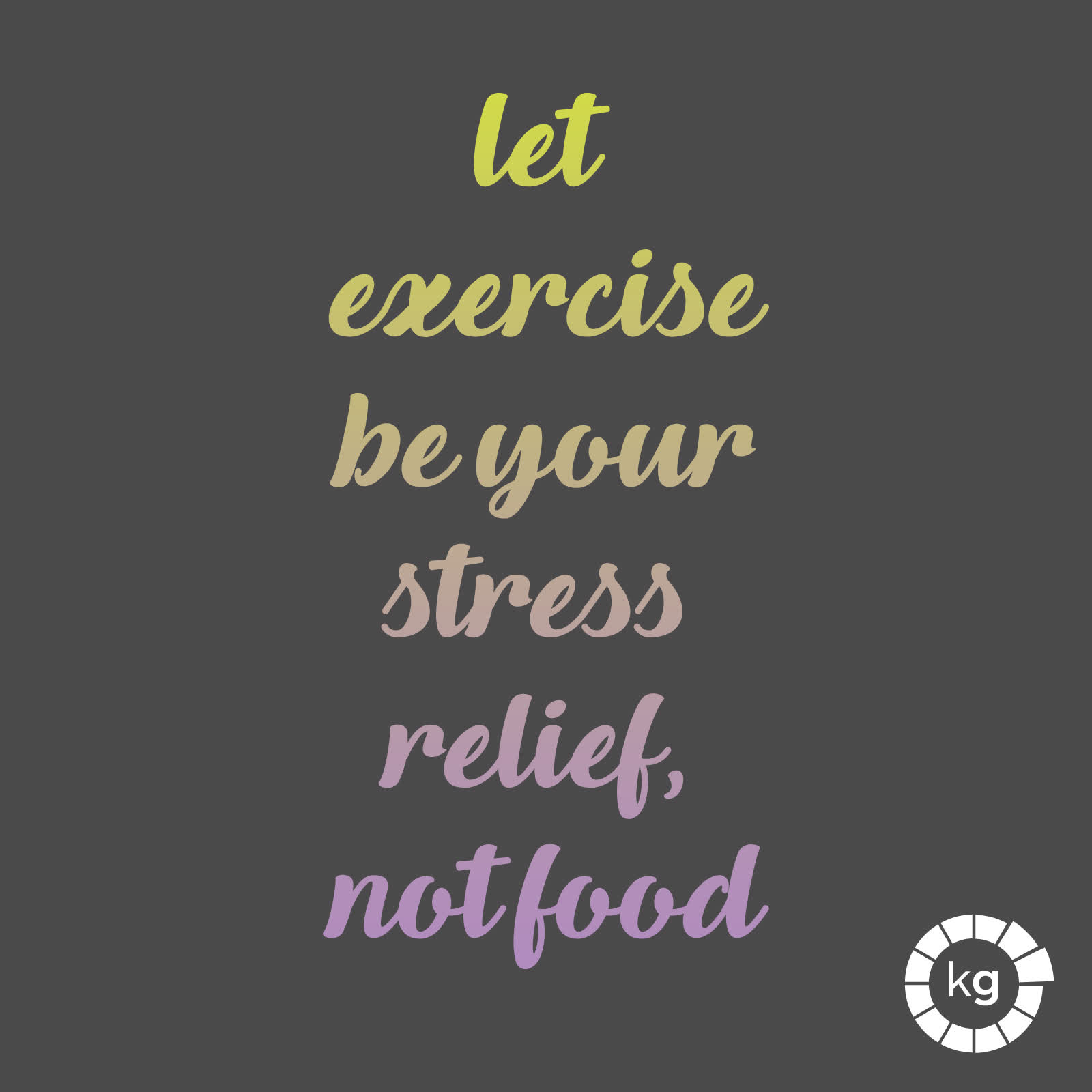
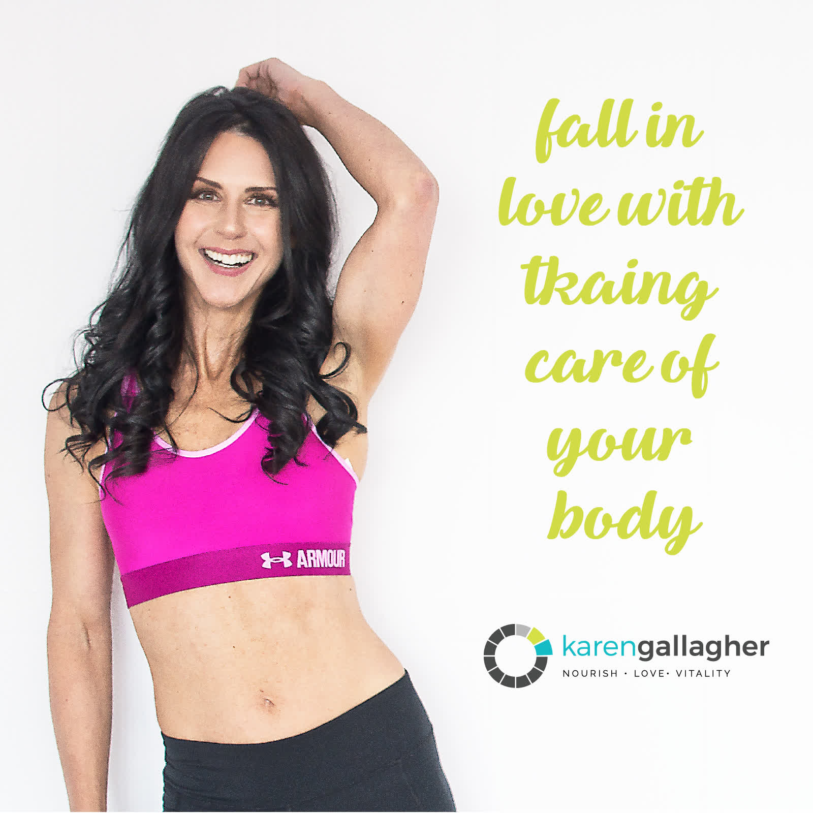
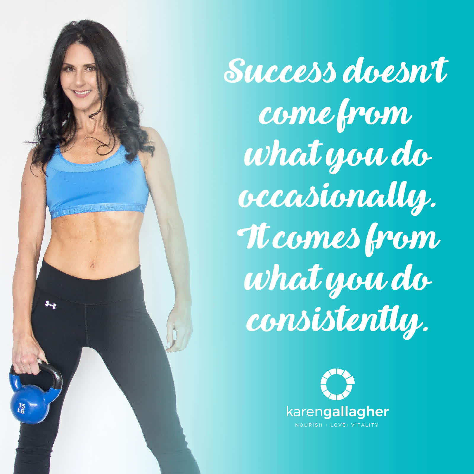
Social Media Posts
To develop Karen’s initial brand recognition and help build her authority as an expert in her field, we created these social media posts. They will give followers multiple opportunities to see her messaging, colours and brand elements.

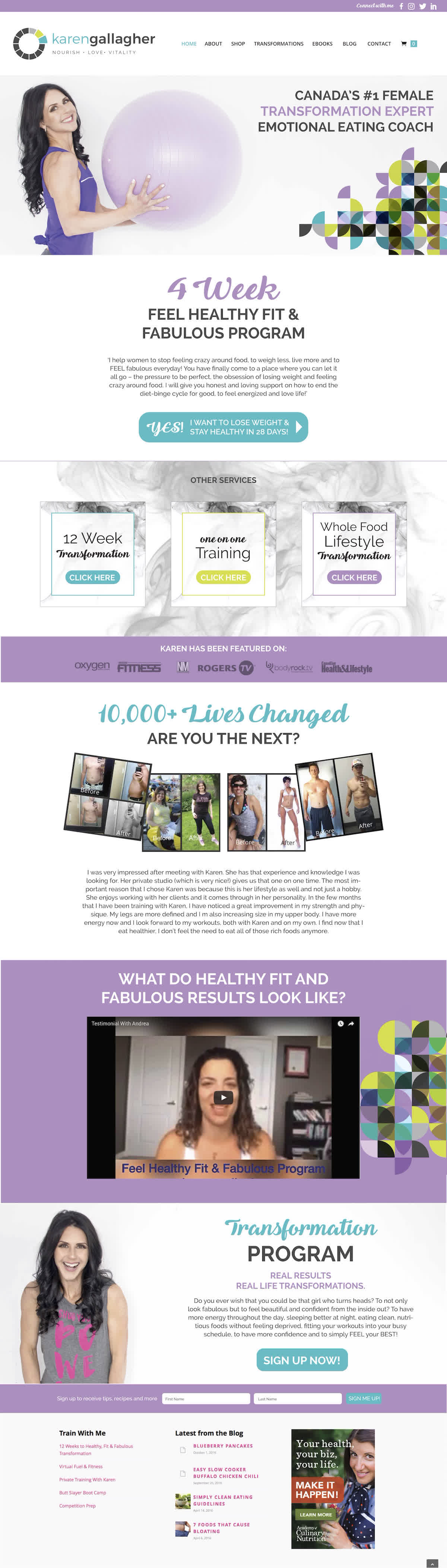
WEB MOCK-UP
Karen already had engaged the services of another web company when she came to work with us, but she did request that we provide her with a mock-up of her new branding that she could submit to the company. This was the layout that we came up with that introduced clients to her work…
Collaborate With Us On Your Next Project!
DID YOU LIKE THIS BRAND? CHECK OUT SOME OF OUR OTHER PROJECTS, AND MAKE YOUR'S NEXT!