Read Up On The Latest!
WE ARE LEARNING MORE EVERY DAY, AND WE WANT TO SHARE IT!
The Blog
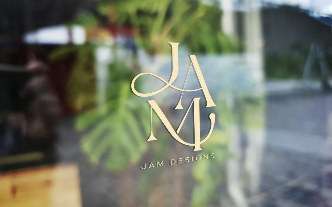
JAM Designs Re-Brand
We helped JAM capitalize on their biggest opportunity, and organized their business into a brand family, bringing order, professionalism and consistency to the business.
No Results Found
The page you requested could not be found. Try refining your search, or use the navigation above to locate the post.
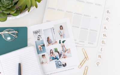
One Logo Concept
One single change to our process resulted in nearly DOUBLING our client satisfaction. Are you using this methodology to deliver your branding projects?
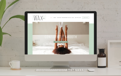
Waxco Website
The WaxCo brand is fresh clean and bright, and we knew the website had to evoke the same feelings. Check out how we utilized their photoshoot and embraced white space in this user friendly design.
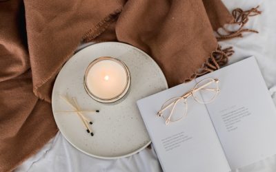
Market Candle Co. Photoshoot
Market Candle Co. has been fast expanding, due in large part to its owner’s highly personable social media. In anticipation of opening her own shop, she…
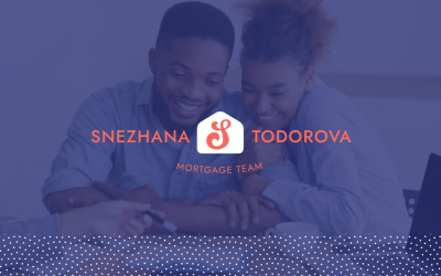
Snezhana Todorova
This mortgage broker was looking for a sharp professional brand so that her marketing was building trust and authority. Now she can focus on her mission to help home owners better manage their mortgage debts…
Sarah Hull – Photoshoot (Spring 2022)
The story of staging a beautiful luxury home is told through these incredibly elegant visuals. Multiple outfit changes and phases of the project were all captured…
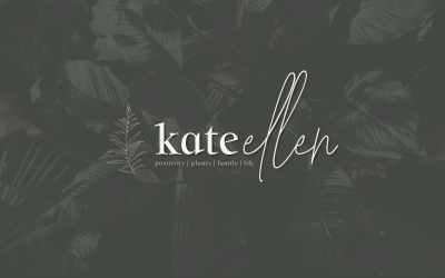
Kate Ellen – Branding
Can we help mature this mommy-bloggers visuals? Lets give her a more sophisticated lifestyle brand!

One Logo Concept
One single change to our process resulted in nearly DOUBLING our client satisfaction. Are you using this methodology to deliver your branding projects?
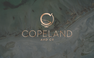
Team Copeland – Branding
This family real estate team was looking to unite their efforts under a classy brand that represented the Northumberland Hills and their personal talents and tastes. What do you think about this upscale yet down to earth brand.
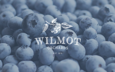
Wilmot Blueberry Orchard
Like many farms and orchards, this was a family business, and as management of the company passed to a new generation, it became a priority to update and modernize the company’s visuals. See how we did it while honoring the heritage of the blueberry orchard.
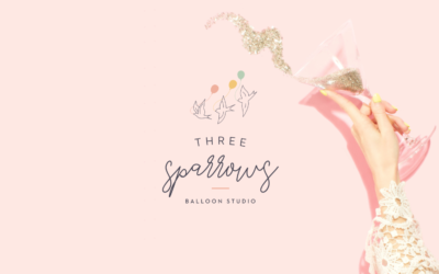
Three Sparrows Balloon Studio – Branding
This logo has special meaning for this business owner, who actually had it tattooed on her forearm! A frequent collaborator with Brand Ambition, we love watching this company grow and are thrilled to share this professional party brand.
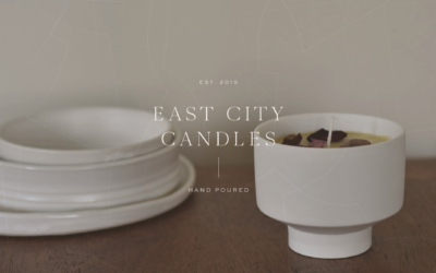
East City Candles – Branding
This brand was designed to match up with the nostalgic photography and colour palettes of Laurel’s work. An early break from the bright watercolour shades that were popular at the time, it is filled with personal meaning and will always be special to our team.
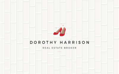
Dorothy Harrison – Realtor – Branding
Check out how we made this Wizard of Oz real estate brand seem sophisticated yet playful while sticking to the challenge of keeping it “Remax compatible”.

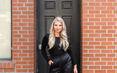
Sherry Zwetsloot – Realtor – Photoshoot
This shoot for real estate agent Sherry Zwetsloot was inspired by “The Devil Wears Prada” because we couldn’t resist Sherry’s sharp wardrobe and strong boss-lady vibes! Shot half in our studios, and half in beautiful downtown Cobourg.
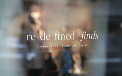
Redefined Finds – Branding
Re-defined Finds INSPIRATION: This successful shop has been in business for several years and was celebrating by updating her interior decor. We were so thrilled when her interior designer at The Inspiration Nest recommended us to update her brand to match! Nominated...
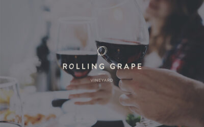
Rolling Grape – Vineyard Branding
We created the brand, labels, and website, and have been a long-term collaborator with this family-owned farm.
Jennifer Langille – Remax Agent – Photoshoot
This very successful Remax agent came to us to further establish her personal brand. Her photoshoot followed simple guidelines with a simple, uncluttered look that would compliment her Instagram aesthetic.

Uniquely Whynot – Cricut Organizer – Photoshoot
We loved helping this company go from side hustle to serious brand, with a professional photoshoot showcasing their Cricut tool organizers. Is your craftroom ready for this level of organization?
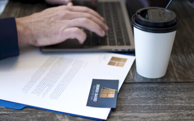
Derek Baird Team – Branding
Derek Baird is passing his very successful real estate team to his sons. We worked with them to collaborate on an updated modern brand that paid homage to their dad’s legacy. These remain some of our favorite shoots ever, with images that are now on billboards across their local area.
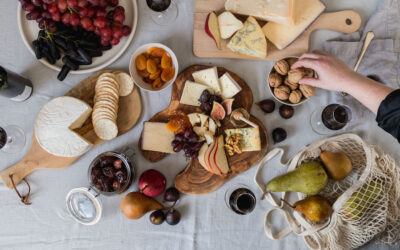
The Rustic Board – Photoshoot
These images, set up by our food stylist, Beth, are lighting up social media and spurred sold-out Christmas and New Years’ orders. We sure enjoyed the snacking between the sets of this decadent photoshoot!
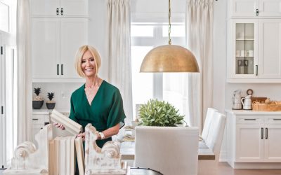
Stonehouse Staging – Branding
It was a stroke of genius when our designer came up with the simple hand-drawn house logo. It looks like something that is on every family refrigerator door, and it warms our hearts. This brand channels HOME, just like Jill’s magical syle.
Stonehouse Staging -Photoshoot
As the exclusive staging company for The Nook Realty, this team of ladies brings style, fashion, and a unique sense of home decor to Nook listings. We wanted to bring that same energy to their shoot. Luckily, it’s easy to capture their creative natures and see how much they love working together.
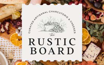
The Rustic Board – Charcuterie Brand
We knew a hand-illustrated logo was a MUST to match this brand’s “rustic” vibes. And of course, we recommended that a charcuterie company have a photoshoot so that we could play with all that yummy food!
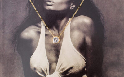
Saint Revibe – Product Shoot
This jewelry company from Georgia makes handmade gold necklaces and wanted to achieve a clean and moody Instagram aesthetic. She asked us for a styled shoot that reflected her African American target market and client base
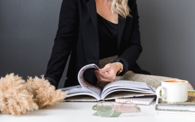
Birchview Design – Lifestyle Photoshoot
This design team from Peterborough has its eyes on growth! Exploring new business ventures and professionalizing their presence in their area are all 2021 goals.
This photoshoot will be the foundation of upgraded social media, website updates and new presentation decks for project pitches.
Shameer Arain – realtor brand
A sleek and sophisticated brand positions this professional as a leading Toronto realtor. Predominately black and white visuals with strong architectural influences suggest power with elegance. A punch of modern orange makes this aesthetic instantly recognizable.
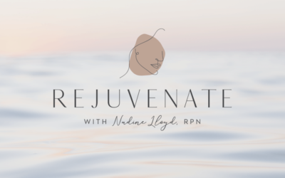
Rejuvenate – Spa Brand
We gave this spa brand a modern, clean look, utilizing a very trendy line art in the logo. Nadine wanted the brand to feel upscale, simple and peaceful. This beauty service is truly beautiful.
Hart’s Espresso
Hart’s Espresso began as a mobile service, but recently opened its first location in Bowmanville and needed to update its look to match its high-end coffee culture experience.
Nicholls & Associates – Interior Designers
This well-established interior design firm is a leader in its industry. Nicholls & Associates has passed from its founder to a new generation of talent and It needed to be updated while keeping the look recognizable to its long-term clients. We helped to modernize its visuals while paying respect to its heritage.
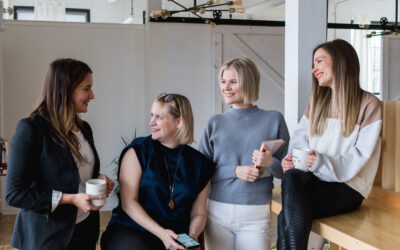
Managing A Team During COVID-19
As a business owner, my great moments of satisfaction occur when I'm walking through the office while all my employees are hustling. I love the hustle and the energy. Seeing some people with headphones on, deeply focused on a project, while others are grouped around a...
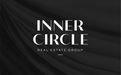
Inner Circle Jane Thuet – Realtor Brand
Real estate agent Jane Thuet was looking for a gender-neutral, black and white brand. Thanks to a great team name, we were able to create this sleek, attractive look that will draw both clients and talented agents to grow the brand.

Online Clinic – Naturopathic Brand
This team of professionals in naturopathic medicine and natural health care are teaming up to create an online resource for clients. This bright, approachable and tech-friendly brand gives everyone access to holistic healthcare – no matter where they live!
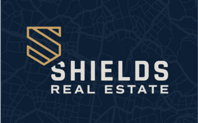
John Shields Realtor Branding
This professional masculine real estate brand features a highly symbolic logo. The iconography includes a shield, a Superman symbol, and a men’s tie, all rolled into one!